Dressing up the Cover – Part 1
This is Part 1 of the Dressing up the Cover tutorial. Font selection is vital in the successful creation of a cover. For example, the use of Comic Sans MS for a horror novel may come across as a poor fit. Unfortunately, navigating through the sheer volume of existing fonts can be an arduous task.
Fortunately, a fair amount of the leg work has been done for us. Creative Indie has a page entitled 300+ Fool-Proof Fonts to use for your Book Cover Design which outlines popular fonts based on specific genres. Still, there are aspects you should consider prior to selecting your fonts.
What Is the License?
Let us take a look at the font Moonlight Shadow to explain. This beautiful font suits multiple genres, including Fantasy and Gothic Horror. However, this font has license restrictions which requires licensing. The price for a license varies from $10 to $100 USD based on uses.
|
Note As a general rule, if you download a font and there is no licensing information, then it is likely pirated. Conduct a more thorough search online to confirm its license. |
Sites like the Open Font Library can be useful to work around paid licensing. This site and others like it cater to free and open source fonts; albeit it at the cost of a reduced selection. Alternatively some fonts are available to you when you buy and install vendor software. An example of this is Trajan Pro, which is installed with Adobe Photoshop.
Some sites will offer up a free version of the paid font. These tend to be crippled in some way, such as limited character sets, styles, kerning and so forth. Even with these limitations, this is a great way to determine if a font is suitable before paying for it.
What Formats Are Available?
Microsoft Windows supports True Type Fonts and Open Type Fonts. These are the most common font formats found today. However, there are other formats out there which will not import. Keep that in mind when searching for fonts.
|
Note Corel PaintShop Pro does not need to be restarted to see new fonts. This can be a great timesaver when experimenting with new fonts! All you need to do is open the Font Selection Drop-Down menu to access new fonts. |
How Does It Look?
Selecting a font can be difficult when you are looking at a small sample set. I found it helpful to group favourites together on one image. That way they can be compared as a group, the following image showcases this.
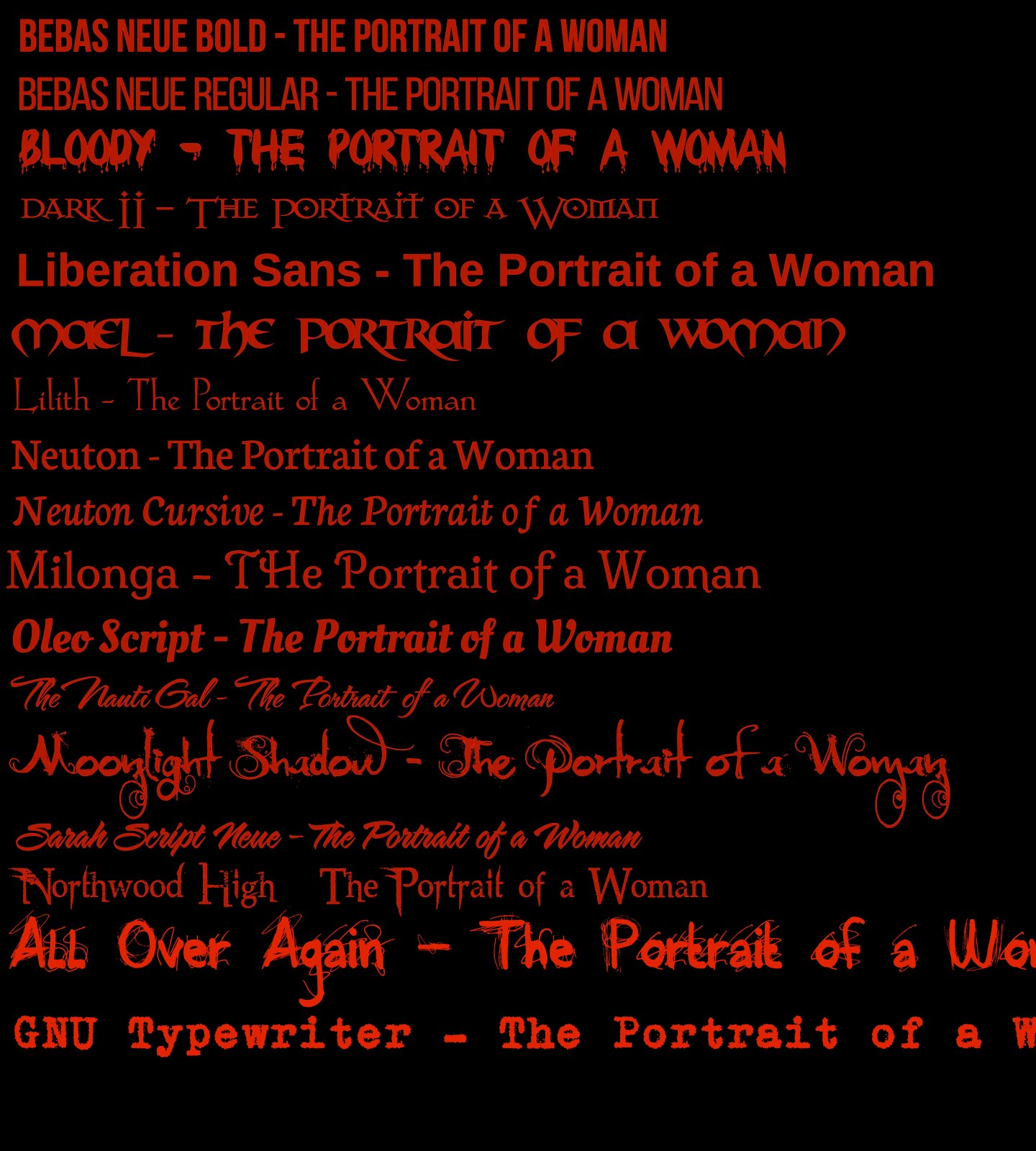
I used the title of the novel above to see how it appears using that specific font. While most of these were selected because they were free or open source, there are some paid fonts included as well.
The reason this image was created using a red font over a black background was to see how these appeared at reduced resolutions. Red on black tends to degrade quickly when resolutions drop, which is a key feature to note since Amazon.com shrinks your covers down to 160px for thumbnails.
Next in Part 2, we will discuss Caveats and Workarounds.
![]() Selecting the Font by Evelyn Chartres is licensed under a Creative Commons Attribution-ShareAlike 4.0 International License.
Selecting the Font by Evelyn Chartres is licensed under a Creative Commons Attribution-ShareAlike 4.0 International License.


Leave a Reply