Tag: Texts

  • Taglines and Layer Styles

    Dressing up the Cover – Part 5

    This is Part 5 of the Dressing up the Cover tutorial and previously we covered Borders and Text.

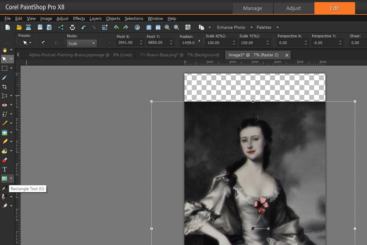
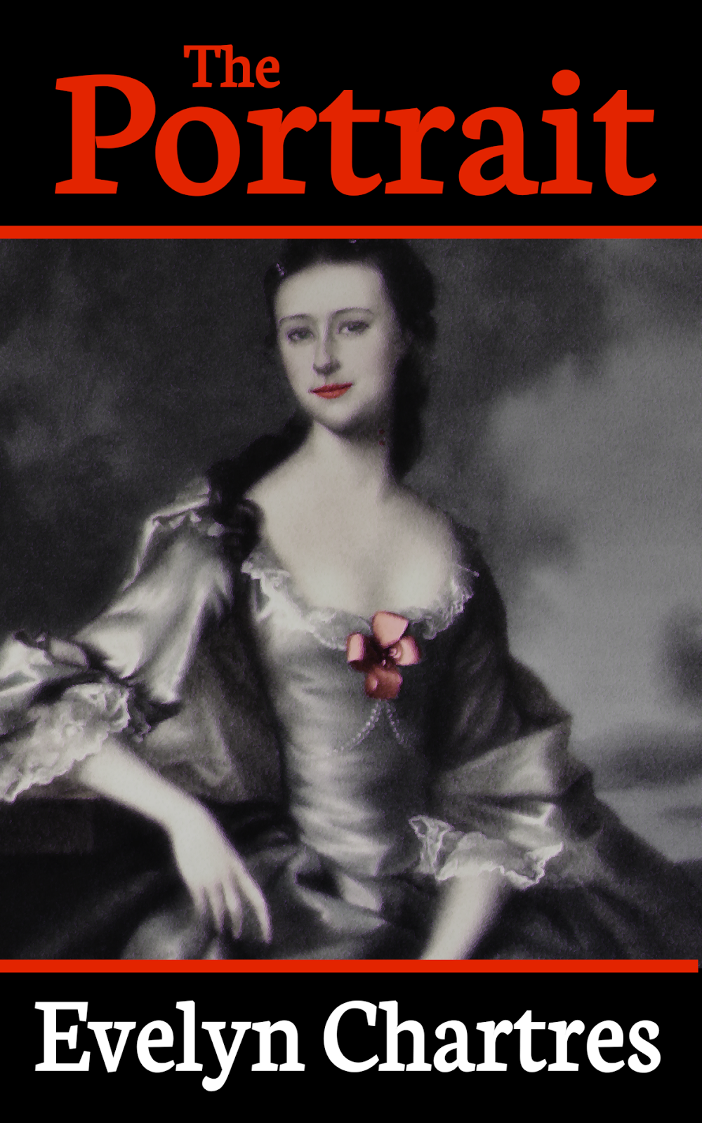
    Make use of the Pick Tool from the Tools Bar to reduce the size of Lady Shade until she fits within the confines of the borders. Take your time to ensure that the resize operation is done using one of the Corners to maintain Aspect Ratio.

    Note

    Sometimes the Pick Tool will not Resize. Attempts to modify will instead alter the Perspective which is not the desired behaviour. To correct this behaviour change the Mode to Scale.

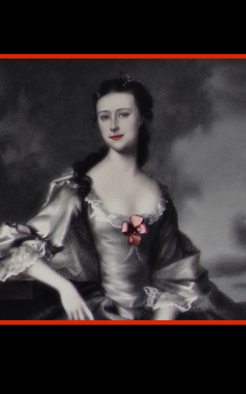
    After completing your adjustments Lady Shade should look roughly like below.

    20-Lady-Shade-Adjusted.png

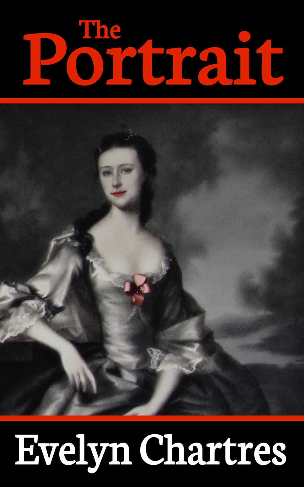
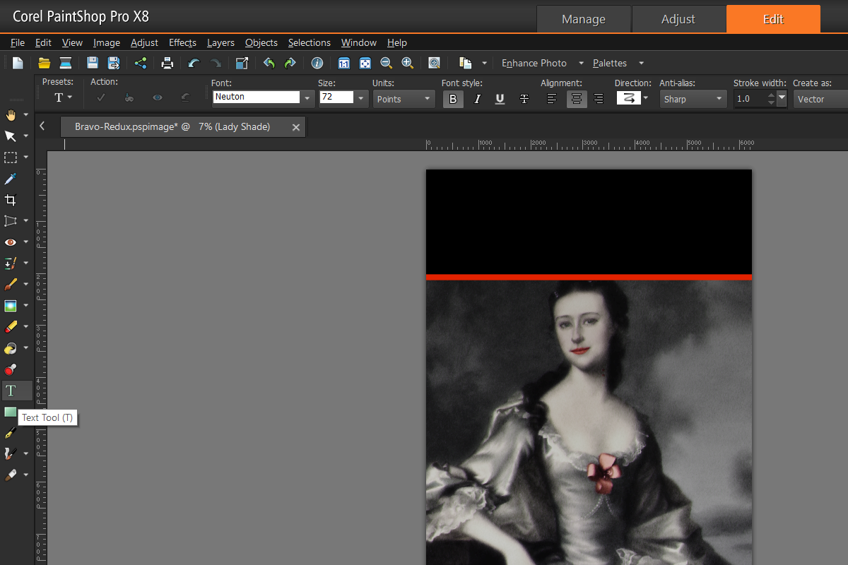
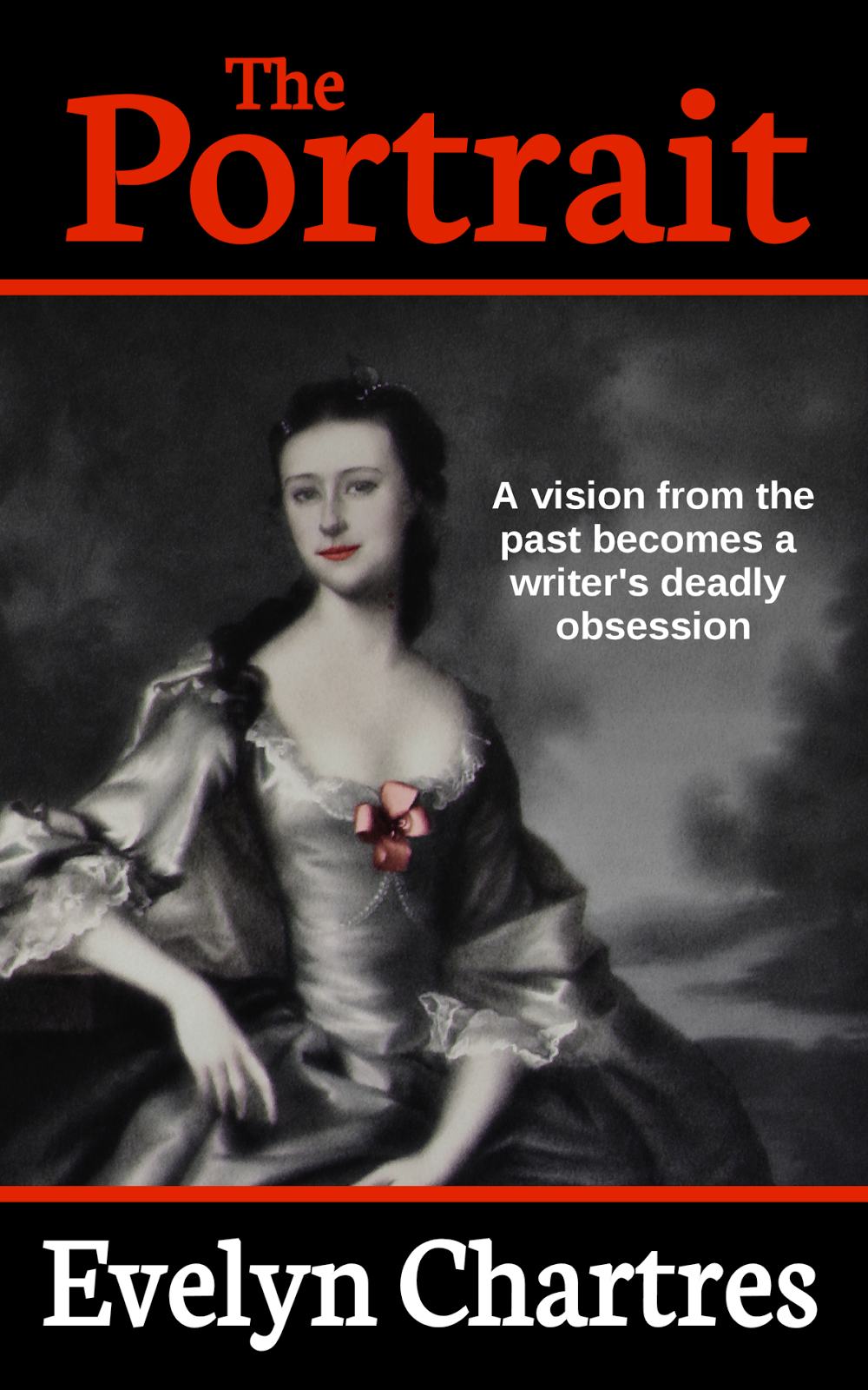
    Now is the time to add a Tagline, a sentence or short paragraph which is used to grab a reader. Since we not use complex Layer Styles for this section we can go ahead and create it one layer.

    The Liberation Sans Font was used for the tagline. The Font Size was set to 72 Points so we can work on it later. Note that Bold or Italics in the Font Styles were not selected.

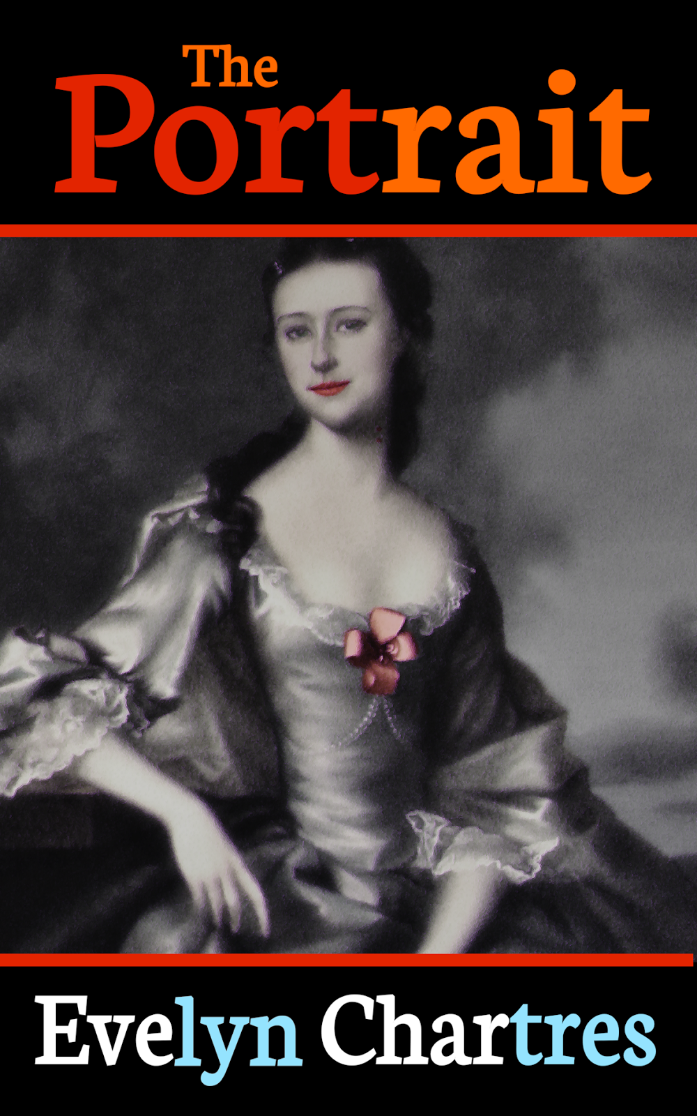
    To match our example the following line was used:

    A vision from the

    past becomes a

    writer’s deadly

    obsession

    Once the text is inserted, resized then moved the appropriate location (shown below) the image should resemble the following.

    21-Tagline-Inserted.png

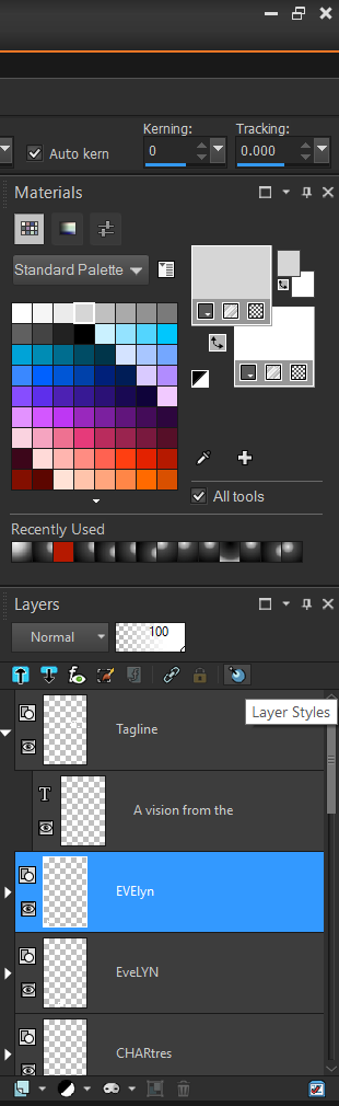
    Next make use of Layer Styles to finish up the Text Lines and Borders.  From the Layers Panel, select one of your Author’s Name Layer’s then click on the Layer Styles icon.

    22-Layer Styles.png

    The Layer Properties window will open and feature effects applicable to layers. As seen below, operations range from Reflection and Drop Shadow effects.

    23-Layer-Styles-Window.png

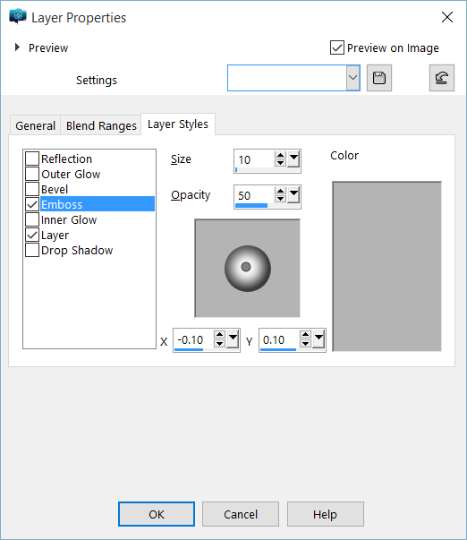
    For the Title and Author we want to make use of the Emboss style, use the settings above then click on OK to set the Layer Style. This process must be repeated for each layer, so save these settings to use as pre-sets. This will ensure consistency throughout all of the elements.

    24-Layer-Styles-Window-Tagline.png

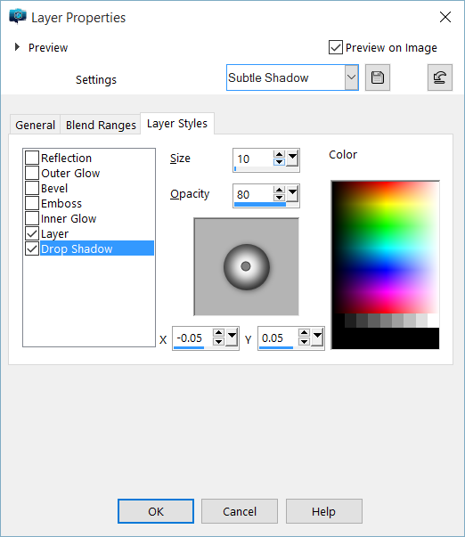
    Now for the Tagline Layer, we will adjust Drop Shadow. You can copy the settings found above, to provide a subtle shadow effect to create the illusion the tagline floating over-top the Lady Shade Layer.

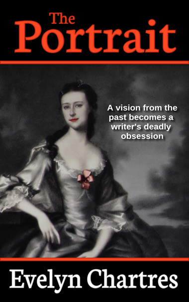
    Use Layer Styles to Emboss the Borders as well. Once complete the cover should appear as it does below.

    In Part 6, we will talk about Notes and Variants.


  • Borders and Text

    Dressing up the Cover – Part 4

    This is Part 4 of the Dressing up the Cover tutorial and previously we covered Creating a New Image and Placing Lady Shade.

    To continue with our design, we need to add two rectangles that have a Black Border and Fill. From the Tools Bar, select the Rectangle Tool.

    15-Rectangle-Tool.png

    Create two new Rectangles, one at the top and the second at the bottom and have them in the same Vector Layer to manage. Also ensure the Lady Shade layer is just above the Background Layer else the rectangles will be obscured.

    Now create a Rectangle that has a Red Border and Fill. This one will be small and narrow to create a transition between the Lady Shade Layer and the Filler Layer. Duplicate this Rectangle using CTRL-C/CTRL-V combinations then move them over the transition points.

    These two Rectangles should be grouped as this permits the application of consistent Layer Styles later on. This Borders Layer should then be placed on top the Filler Layer.

    The image should appear like the one shown below.

    16-Rectangles-Added.png

    Now it is time to add text. For now, we will work on the Title and the Author’s Name. These elements are prominently found on covers, although the prominence of the Author’s Name tends to vary with name recognition.

    From the Tools Bar select the Text Tool.

    17-Text-Tool.png

    As seen above, the Neuton Font was used for both the Title and Author’s Name. Since we are working at high resolutions, setting the Font Size to 72 Points and Bold is enough to both select and adjust at a later time.

    Because Layer Styles will be used later on, the Title and Author’s Name are broken into smaller chunks. The image below denotes the different segments by alternating colours.

    18-Fonts-Adjusted-Coloured.png

    Using the tricks learned in Higher Resolution Blues, we lined up then Link the layers for both the Title (3) and Author’s Name (4).

    Note

    Make sure to line up the individual elements before making any alterations.  Once dimensions change, replicating the change in individual components is difficult to achieve.  To adjust a line, select all layers by holding down the SHIFT key.

    Experiment with these Text Lines until it looks like the image below. Be aware that you may need to move the Border Layers in addition to adjusting the Filler Layers to achieve this result.

    19-Fonts-Adjusted-Normal.png

    Note

    When you want to resize a Text Line, always do so from the Corners. Using the other methods will stretch and skew the Text Line.

    In Part 5, we will Add the Tagline then Adjust Layer Styles.


Search