Tag: The Portrait of a Woman

  • Blurring the Lines

    It’s not everyday that one gets to blur the lines between fiction and reality. Using a high quality version of my cover, I had a 20 x 30 inch canvas print of the Lady made.

    So what is a canvas without a frame?  I had a local shop build me a custom frame using two separate borders. I have to admit that rather like the final product. Although I will say that I am likely biased!


  • A Portrait’s Vanity

    I got a few copies of The Portrait in the mail from CreateSpace the other day, but could not inspect the package due to a business trip. This is the first time since my arrival that I’ve been able to get a good look at them and I believe they came out well!

    As previously mentioned, this edition is in black and white which significantly reduced the prices. The images turned out well and are clear, additionally the four pages that were flagged as having unusual characters came out as they did in the preview… flawless. So yes, I am rather happy how they turned out!


  • A Belated Time to Celebrate

    Featured_Belated_Time_To_Celebrated

    I was making sure that all of my storefront links to the Portrait were valid, when I noticed that my novel had reached 150 downloads on Smashwords.  Well it is 151 because I was rather late in noticing the milestone.

    My decision to target Smashwords seems to have been a good one.  Here are some reasons why:

    • Smashwords has enabled me to target other sites such as Kobo, iBooks, Scribd and Barnes and Nobel without creating individual accounts.
    • Smashwords has a user community of its own and have left more comments than any other.
    • Smashwords has not buried my book under tons of new material.  I still get views, even if the downloads have waned. I have to be realistic, pushing people to view and download a book can be a full-time job all by itself!
    Smashwords-Chart-Views-Portrait-Aug-16
    Last 30 Days of Statistics for the Portrait Page Views
    Smashwords-Chart-Downloads-Portrait-Aug-16
    Last 30 Days of Statistics for the Portrait Downloads

    While this is an achievement (albeit a minor one), I did not feel it was worth the effort or calorie intake to make a full-sized frosted cake.  I will save that type of indulgence for later!


  • An Unexpected Review

    I am rather negligent when it comes to looking up my book on sites to see if someone has read the book and left a review. While Smashwords had a strong initial trend of views and downloads, it has since slowed down.

    Reviews Full Text – The reader liked the story. The reader found the over-use of the author, the artist, and the dreamer annoying. The reader still gave 5 stars. The reader will read other books by this author. The reader couldn't write a book if she tried so please take the readers criticism with a grain of salt. The reader thanks you.
    Screen capture of the original review and rating on Smashwords.

    That is to be expected, since The Portrait has been out a while and I do not actively push the content. However, it has yielded some reviews over time and I came across this one today!

    Any review that says the reader will grab my next book is a great news for me. So I thought it would be nice to share!


  • The Portrait on Smashwords – Broke One-Hundred Downloads!

    In February of this year, I released The Portrait. During its previous incarnation as The Portrait of a Woman, it saw little traffic and activity graphs conjured up images of a patient flatlining.

    At least my decision to move away from Amazon‘s Kindle Direct Publishing sphere of influence and branch out into additional markets has breathed life into the project. On Smashwords, the novel has broken a hundred downloads (was 118 when I posted) and still sees daily views.

    Shamshwords_Stats
    Last 30 Days of Statistics for The Portrait.

    While downloads may be waning on the graphs, I prefer to not make draw any definite conclusions.  The book is available through considerably more markets and is free! After all, what is the value of a novel if you cannot actually sell it?

    Smashwords has also been wonderful in delivering my eBook to other markets.  True you may have more control if you do it yourself, however for free novels this I feel this feature is invaluable.


  • Notes and Variants

    Dressing up the Cover – Part 6

    This is Part 6 of the Dressing up the Cover tutorial and previously we covered Taglines and Layer Styles.

    t_21-Tagline-Inserted.pngNotes on Bravo

    Bravo was originally released along with two (2) other variants and was by far the most popular of the three (3). Feedback shown below led to the creation of other variants.

    Bravo caught my attention better than the others.

    Bravo looks the most professional, although the fonts are kind of sterile.

    I’m not a fan of any of them. They all scream —self-published— in the worst of ways.

    None of them say horror to me.  If you’re sold on using the image, I’ definitely try to bring it out in the fonts.  Look at some popular horror titles and see what they use.  That will give you an idea of what communicates —horror— to readers.

    Overall, the points brought forward were related to the choice of font and how the cover did not fit the ideal horror cover. The Portrait does not subscribe to the modern ideals of horror, at least in terms of gore playing a large part.

    People expected to see streaks of blood, fangs protruding from the lady’s mouth or vast amounts of gore. This worked against the story of the premise where the supernatural settings are concealed for most of the novel and would potentially spoil the surprise!

    There was a noticed distaste for the red borders employed with this particular variant. While I initially believed that they infused the cover with a bit of colour, people predominantly disagreed and preferred to have no transitions as all.

    Over all I managed to pick up a few points to work on:

    • Keep some distance between the outside edges of the image and the font. Text elements are more likely to remain visible if the image needs to be truncated or applied to a printed cover;
    • The use of red for fonts to add in colour may not work out as expected. Red does not display well in black and white images;
    • There is a strong preference for covers to use an image covering the whole of the visible area. This led to the development of Hotel and India variations which are covered later;
    • Font selection is key and has been discussed before. There was a strong push for Trajan Pro as a general-purpose font.

    Some  recommendations were applied to Bravo which created the variant below.  While it does not address all of the faults, it does provide an incremental improvement.

    A Hotel Visit

    Hotel was a variant that aimed to make use of different fonts that would grab the attention of a potential reader.  This version also made use of transparencies and the outer glow effect which differs from other versions.  While Hotel universally reviled in comments it does have certain features that were fun to explore.

    You will need to make use of the Lady Normal Base, to proceed with this aspect of the tutorial.

    The cover size is longer than the original image allows . To achieve this we needed to create a mirror image copy then join them at the seams. This increases the space above her head to prevent the Author’s Name from obstructing her face.

    From the Image menu, select Canvas Size.

    30-Canvas-Size-Select.pngA new Window appears, which permits you to adjust the Size of the canvas. Increase the Height of to 16000 pixels then ensure Placement is set to Bottom, Middle as shown:

    31-Canvas-Size-Options.png

    Click on the OK button, which adds an empty space above the image found.

    32-Canvas-Size-Result.pngUsing the Selection Tool, make a copy of the top portion of the Base then Paste as a New Layer. You up with two copies of the Top with the new selection that needs to be flipped.

    From the Image Menu select Flip then Flip Vertical.

    33-Flip-Vertical.pngLine-up the images as though they were part of a mirror image. Once satisfied with the merger, right-mouse click on the layers then from the Merge Popup-Menu select Merge All (Flatten).

    This operation will merge both layers together. You may need to experiment until the connection is seamless.

    Next add the Author, Title and Taglines. As mentioned previously, Layer Styles for Author and Title employ of Outer Glow, Emboss and Transparencies to get the desired effect. To reproduce the effects showcased on the cover the following fonts were used.

    • Title — Bebas Neue Bold
    • Author — Oleo Script
    • Tagline — Cinzel (Bolded)

    For Layer Styles adjust until settings match the options below:

    35-Layer-Styles-Emboss.pngThe next step is to adjust the Outer Glow, set it to match those shown below:

    34-Layer-Styles-Glow.png

    While there are a lot of ways to adjust transparency, you can do so from the General Tab of the Layer Properties window. Copy the settings found below then save it for later use. This ensures consistency when applying it to other layers.

    The Tagline only makes use of Emboss, copy the settings below to match our style.

    35-Layer-Styles-Transparency.png

    The Tagline only makes use of Emboss, copy the settings below to match our style.

    36-Layer-Styles-Emboss-Tagline.png

    You end up with a cover which looks roughly like our sample.

    A Trip to India

    India was not one of my designs. Ironically, an acquaintance used a phone app to whip up a design she felt worked well. This formed the basis for cover design used on The Portrait.

    Other than making use of Lady Ethereal as a base, this design uses techniques which have been explained before.  To the following fonts were used:

    • Title – Cinzel (Bolded)
    • Author – Cinzel (Bolded)
    • Tagline – Cinzel (Bolded)

    In Part 7, we will talk about making a Cover Swatch.


  • Taglines and Layer Styles

    Dressing up the Cover – Part 5

    This is Part 5 of the Dressing up the Cover tutorial and previously we covered Borders and Text.

    Make use of the Pick Tool from the Tools Bar to reduce the size of Lady Shade until she fits within the confines of the borders. Take your time to ensure that the resize operation is done using one of the Corners to maintain Aspect Ratio.

    Note

    Sometimes the Pick Tool will not Resize. Attempts to modify will instead alter the Perspective which is not the desired behaviour. To correct this behaviour change the Mode to Scale.

    After completing your adjustments Lady Shade should look roughly like below.

    20-Lady-Shade-Adjusted.png

    Now is the time to add a Tagline, a sentence or short paragraph which is used to grab a reader. Since we not use complex Layer Styles for this section we can go ahead and create it one layer.

    The Liberation Sans Font was used for the tagline. The Font Size was set to 72 Points so we can work on it later. Note that Bold or Italics in the Font Styles were not selected.

    To match our example the following line was used:

    A vision from the

    past becomes a

    writer’s deadly

    obsession

    Once the text is inserted, resized then moved the appropriate location (shown below) the image should resemble the following.

    21-Tagline-Inserted.png

    Next make use of Layer Styles to finish up the Text Lines and Borders.  From the Layers Panel, select one of your Author’s Name Layer’s then click on the Layer Styles icon.

    22-Layer Styles.png

    The Layer Properties window will open and feature effects applicable to layers. As seen below, operations range from Reflection and Drop Shadow effects.

    23-Layer-Styles-Window.png

    For the Title and Author we want to make use of the Emboss style, use the settings above then click on OK to set the Layer Style. This process must be repeated for each layer, so save these settings to use as pre-sets. This will ensure consistency throughout all of the elements.

    24-Layer-Styles-Window-Tagline.png

    Now for the Tagline Layer, we will adjust Drop Shadow. You can copy the settings found above, to provide a subtle shadow effect to create the illusion the tagline floating over-top the Lady Shade Layer.

    Use Layer Styles to Emboss the Borders as well. Once complete the cover should appear as it does below.

    In Part 6, we will talk about Notes and Variants.


  • Borders and Text

    Dressing up the Cover – Part 4

    This is Part 4 of the Dressing up the Cover tutorial and previously we covered Creating a New Image and Placing Lady Shade.

    To continue with our design, we need to add two rectangles that have a Black Border and Fill. From the Tools Bar, select the Rectangle Tool.

    15-Rectangle-Tool.png

    Create two new Rectangles, one at the top and the second at the bottom and have them in the same Vector Layer to manage. Also ensure the Lady Shade layer is just above the Background Layer else the rectangles will be obscured.

    Now create a Rectangle that has a Red Border and Fill. This one will be small and narrow to create a transition between the Lady Shade Layer and the Filler Layer. Duplicate this Rectangle using CTRL-C/CTRL-V combinations then move them over the transition points.

    These two Rectangles should be grouped as this permits the application of consistent Layer Styles later on. This Borders Layer should then be placed on top the Filler Layer.

    The image should appear like the one shown below.

    16-Rectangles-Added.png

    Now it is time to add text. For now, we will work on the Title and the Author’s Name. These elements are prominently found on covers, although the prominence of the Author’s Name tends to vary with name recognition.

    From the Tools Bar select the Text Tool.

    17-Text-Tool.png

    As seen above, the Neuton Font was used for both the Title and Author’s Name. Since we are working at high resolutions, setting the Font Size to 72 Points and Bold is enough to both select and adjust at a later time.

    Because Layer Styles will be used later on, the Title and Author’s Name are broken into smaller chunks. The image below denotes the different segments by alternating colours.

    18-Fonts-Adjusted-Coloured.png

    Using the tricks learned in Higher Resolution Blues, we lined up then Link the layers for both the Title (3) and Author’s Name (4).

    Note

    Make sure to line up the individual elements before making any alterations.  Once dimensions change, replicating the change in individual components is difficult to achieve.  To adjust a line, select all layers by holding down the SHIFT key.

    Experiment with these Text Lines until it looks like the image below. Be aware that you may need to move the Border Layers in addition to adjusting the Filler Layers to achieve this result.

    19-Fonts-Adjusted-Normal.png

    Note

    When you want to resize a Text Line, always do so from the Corners. Using the other methods will stretch and skew the Text Line.

    In Part 5, we will Add the Tagline then Adjust Layer Styles.


  • New Image and Lady Shade

    Dressing up the Cover – Part 3

    This is Part 3 of the Dressing up the Cover tutorial and previously we covered Caveats and Workarounds.

    Before creating a cover, look at best-sellers within your genre. They showcase trends and expectations, such as the location, placement and style of image. After some research, I created a series of covers including the Bravo variant.

    We know that Amazon.com requires their covers to be of a certain size. This guideline informs us that a resolution 625x1000px is the minimum resolution. From the File menu, click on New, which will open the New Image Window.

    12-Slate-Create.png

    We are going to create an image that is bigger than required to maintain detail:

    • 6250 pixels wide;
    • 10000 pixels high;
    • 300 Pixels/Inch for resolution; and
    • Transparent.

    Once you are satisfied with the settings, click on OK, which will create a new image base. Now that we have a blank slate, it is time to start adding in elements.

    For this particular version, we are going to use Lady Shade without the Ethereal background. Open up your fully rendered version of this image then copy it into the New Image. To copy a Background, select the Background Layer then use the CTRL-C keyboard combination. Alternatively you can click on the Edit menu then select Copy.

    Click on the Tab for your New Image. Then use the CTRL-V combination or from the Edit menu select Paste As New Layer. This will drop in Lady Shade which takes up more than the allocated space. The end result should look like this:

    13-Copied-Shade.png

    Lady shade is currently not in position, we want her closer to the centre, even if that leaves a blank at the top.  From the Tools Bar, select the Pick Tool then drag it down for a bit.

    Note

    Do not worry if the image moves off the confines of the image.  This has no effect on the layer being moved.

    Resize and adjust as necessary, until you get the result below:

    14-Shade-Adjusted.png

    In Part 4, we will Play with Borders and Text.


  • Caveats and Workarounds

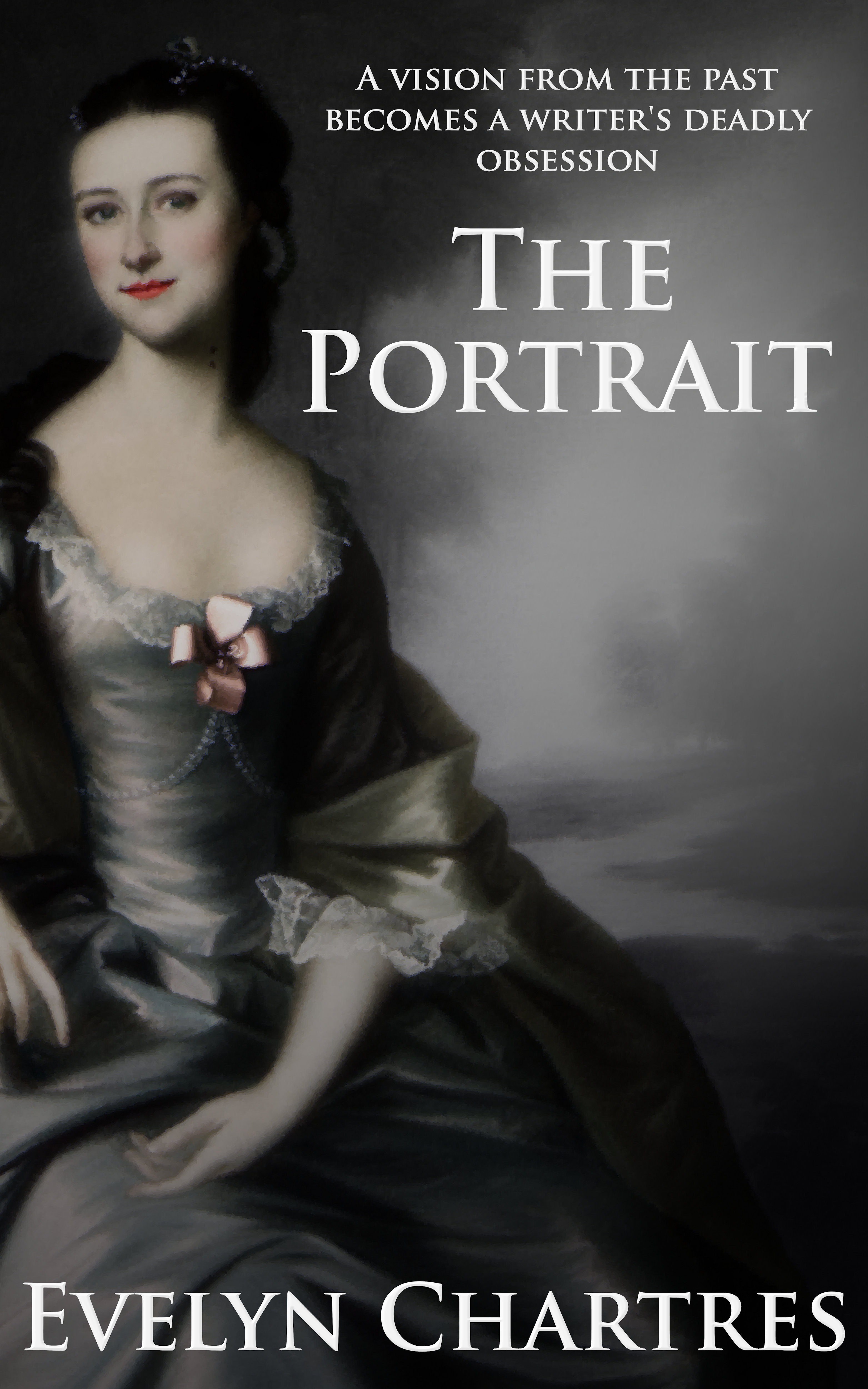
    Dressing up the Cover – Part 2

    This is Part 2 of the Dressing up the Cover tutorial and previously we covered Font Selection and Licensing.

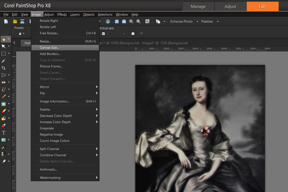
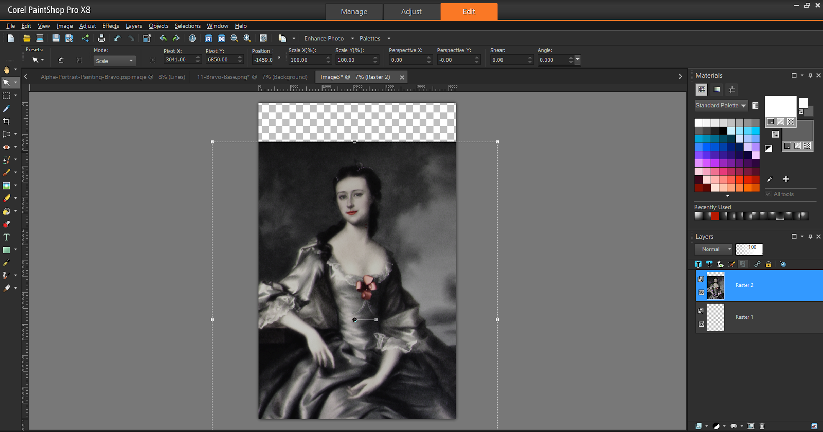
    When using Corel PaintShop Pro there certain behaviours that you should be aware of before moving on. Being unaware of these pitfalls can lead to a great deal of aggravation.

    Resolution Matters

    The resolution that you with with makes a difference for a lot of operation.  If you recall from Digital Alchemy tutorials, we increased the resolution of the image then used Brush Strokes under Art Media Effects to make it look more like painting.  Ever wondered what would happens if this same operation were to be done at a lower resolution?

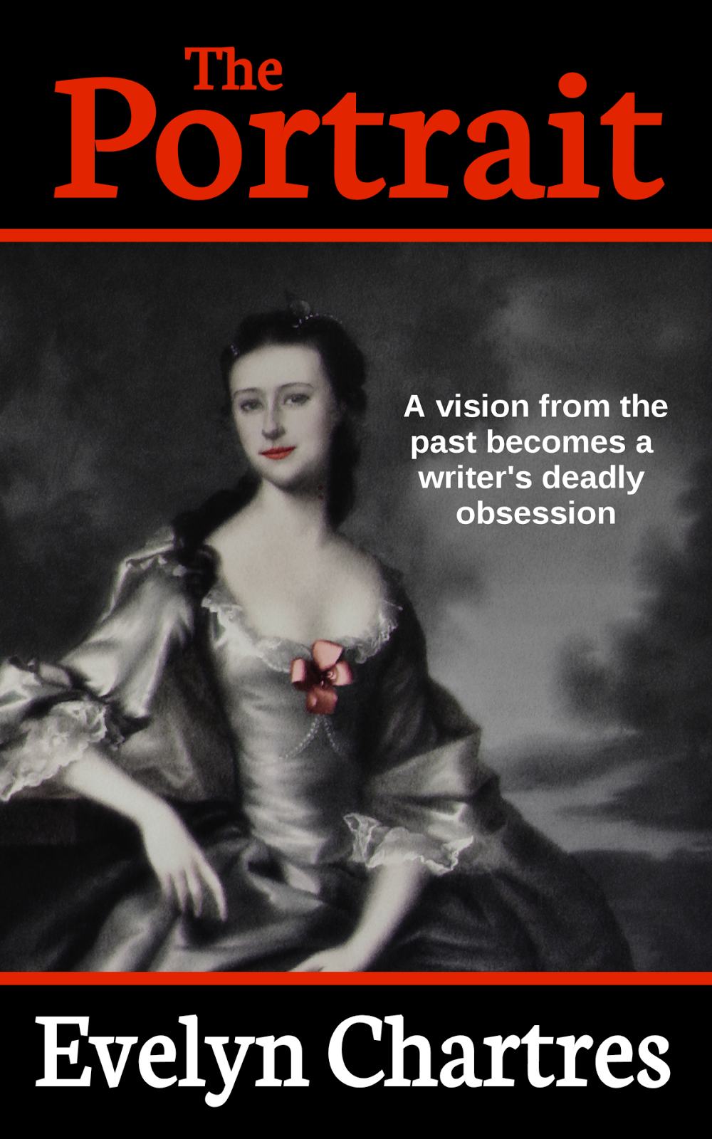
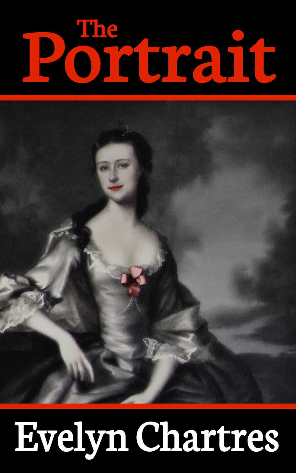
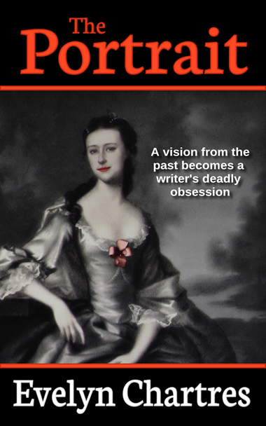
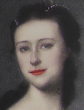
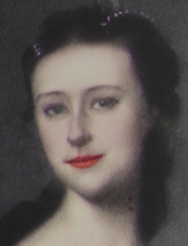
    The image below was generated using the full resolution and matches the one we generated in the tutorial.

    01-Size-Matters-Painting-Full.png

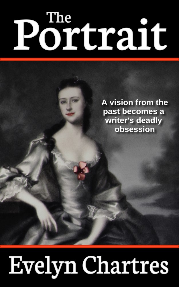
    This second image was done using the original resolution. As you can see, the image is no longer recognizable and most of the details have been lost in the operation. This is not the desired effect since it radically changes the look and feel of the work.

    02-Size-Matters-Painting-Small.png

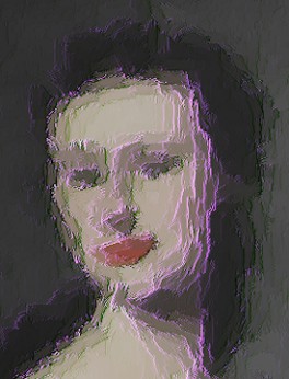
    While we could change the Brush Strokes settings to work on a smaller scale, the truth is that this option is not always available. Hence you may never be able to achieve the same look by working at alternate resolutions.

    Working in large resolutions has its own problems, since memory and processor usage increase so operations take longer. The Brush Strokes effect we used above took several minutes to run at full resolution, while was done in seconds for the lower resolution image.


    Higher Resolution Blues

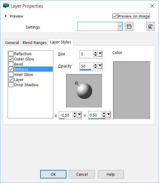
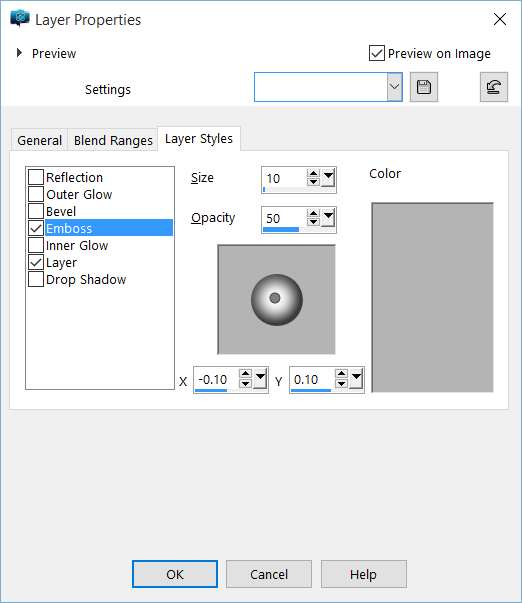
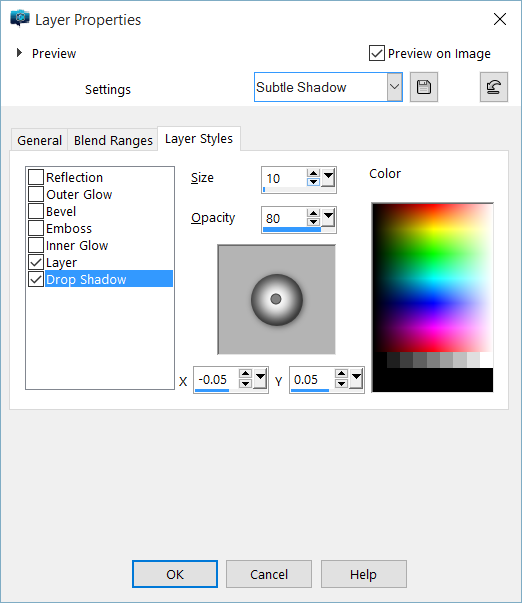
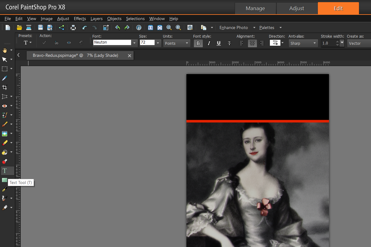
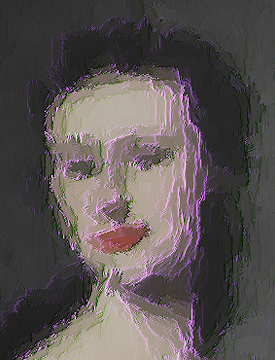
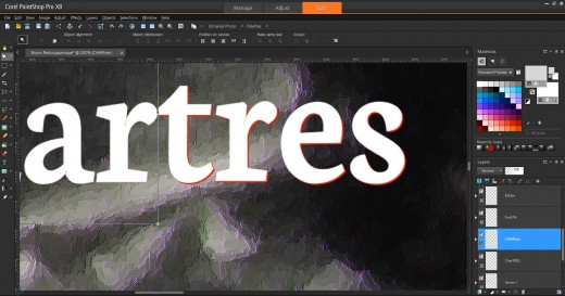
    At higher resolutions, Corel PaintShop Pro will not always complete its operations. When using Layer Styles some text some effects will trail off. This seems to be a problem related to the overall area the program is working with. For example, in the image below we added a Bevel and Drop Shadow.

    03-Size-Matters-Font-Effects.png

    You can see the two last letters are not fully rendered, a matter which is obvious when you compare the two visible T’s in the title.

    Note

    This rendering behaviour was seen in Corel PaintShop Pro X7 and X8.  It may not have existed in prior versions.

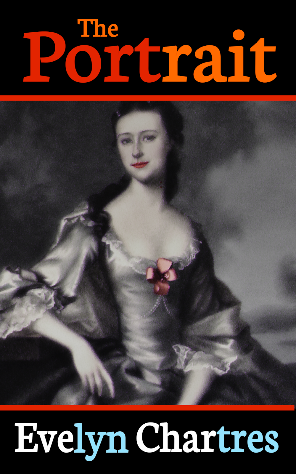
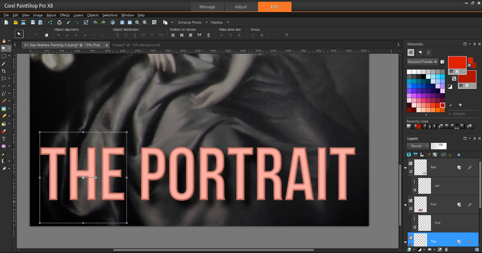
    Fortunately there is a workaround, though it requires splitting the title into multiple Vector Layers. Each layer will be rendered individually to display as expected.

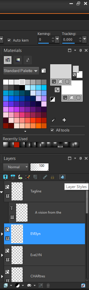
    To make it easier to align the components together, create the complete Text Line, then create them in smaller parts. It is recommended that you use different colours for the reference, so that you can overlay and observe where you not aligned, like below with the tres section of the Author Name.

    04-Size-Matters-Font-Workaround-Create.png

    Above we have both sets of fonts under one Vector Layer. As long as all the components are in the same layer they will render improperly. So we need to create two new Vector Layers and transfer the parts into them.

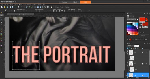
    Once the parts have been moved, you must individually manage Layer Styles for each Vector Layer. Use the same settings for Drop Shadow and Bevel. Once complete your fonts will render correctly like we see in the image below.

    05-Size-Matters-Font-Workaround-Individual.png

    Now that the effect renders properly, the image can be exported without incident.

    Note

    When satisfied with the look of your Layer Styles disable or hide them.  When Layer Styles are on or visible Corel PaintShop Pro slows down noticeably.

    Watch Your Groups

    How you group your elements may play a part in how they are rendered. When dealing with Layer Styles, distant items can create artefacts in between for no logical reason. To showcase this behaviour, we added an Outer Glow effect, with a Transparency and get artefacts in the middle.

    06-Grouping Matters.jpg

    The generated material can be a nightmare to remove, especially at high resolutions since the system responds slowly. The easiest option is to remove this effect entirely and make sure that the Top and Bottom Text Lines are in separate Vector Layers before enabling the effect.

    07-Grouping-Matters-Corrected.jpg

    Now have the effect desired without introduced artefacts.  Easy!

    Unexpected Effects

    There are various behaviours related to the Text Tool which should be noted.

    Creating Multiple Text Lines

    When you are creating a Text Line, you cannot simply click elsewhere to create a new Text Line. One way I found to get around this limitation was to switch to the Pick Tool then revert to the Text Tool.

    Alternatively you can click on the Background Layer which will have the same effect. Additionally this method will force the creation of a new Vector Layer vice stacking them into the same Vector Layer.
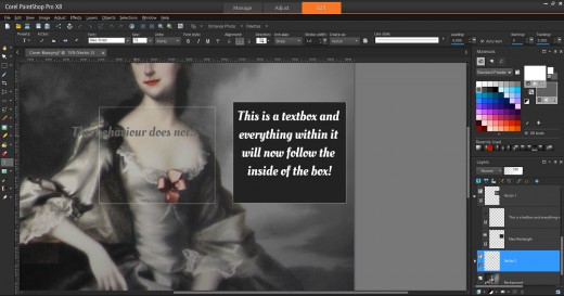
    Text Wrap Around

    The first behaviour relates to elements created when using the Rectangle Tool or similar. Rectangles, ellipses, symmetric and preset shapes will change the behaviour of your Text Tool if you accidentally work too close to them.

    This image outlines one of the more common problems.

    08-Unexpected-Text-Behaviour-Wrap.png

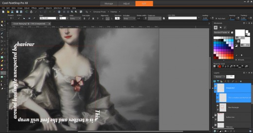
    When we clicked near the border, the icon changed to a Text Tool with a Border. Now text will wrap around the object in question. When expected, this is an awesome feature, otherwise it will drive you up the wall!

    Text Boxes

    Now when you click inside of the box, text will flow within the confines of the shape. This essentially creates a Textbox which is a desirable feature that should have been incorporated into the Text Tool directly. However, there is a catch and if your background is transparent this capability will not be enabled. The screen below demonstrates both behaviours.

    09-Unexpected-Text-Behaviour-Textbox.png

    Watch Where You Click

    Attempting to use items from the Tools Bar have the potential to behave differently. Creating text items in quick succession will group them naturally into a single Vector Layer and lead to the problems outlined in Watch Your Groups.

    As a test we used the Rectangle Tool to create a new Rectangle. We also did not pay attention to the selected layer and ended up passing on the set Transparency and Layer Styles to the new object.

    10-Unexpected-Text-Behaviour-Layers-Selection.png

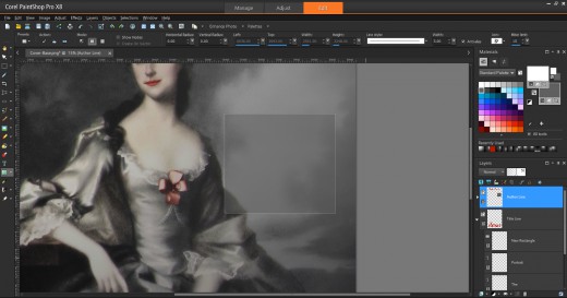
    This can lead to confusion and generate hard to remove artefacts. So be aware of which layer you are working on prior to moving forward.

    Note

    If you get into the habit of selecting the Background Layer prior to every operation, then newly created elements will fall under a new layer.  You can rearrange them at a later time.

    In Part 3, we will create a New Image and Place Lady Shade.


Search