“We have a problem,” Cecil said.
“Hi, Max,” he said. “How are things?”
Cecil was the man who cleaned up messes at The Grand. He lurked in the shadows, and rarely showed his face unless there was a serious concern. This was the Boss’ fix it man that made everyone uneasy including Max.
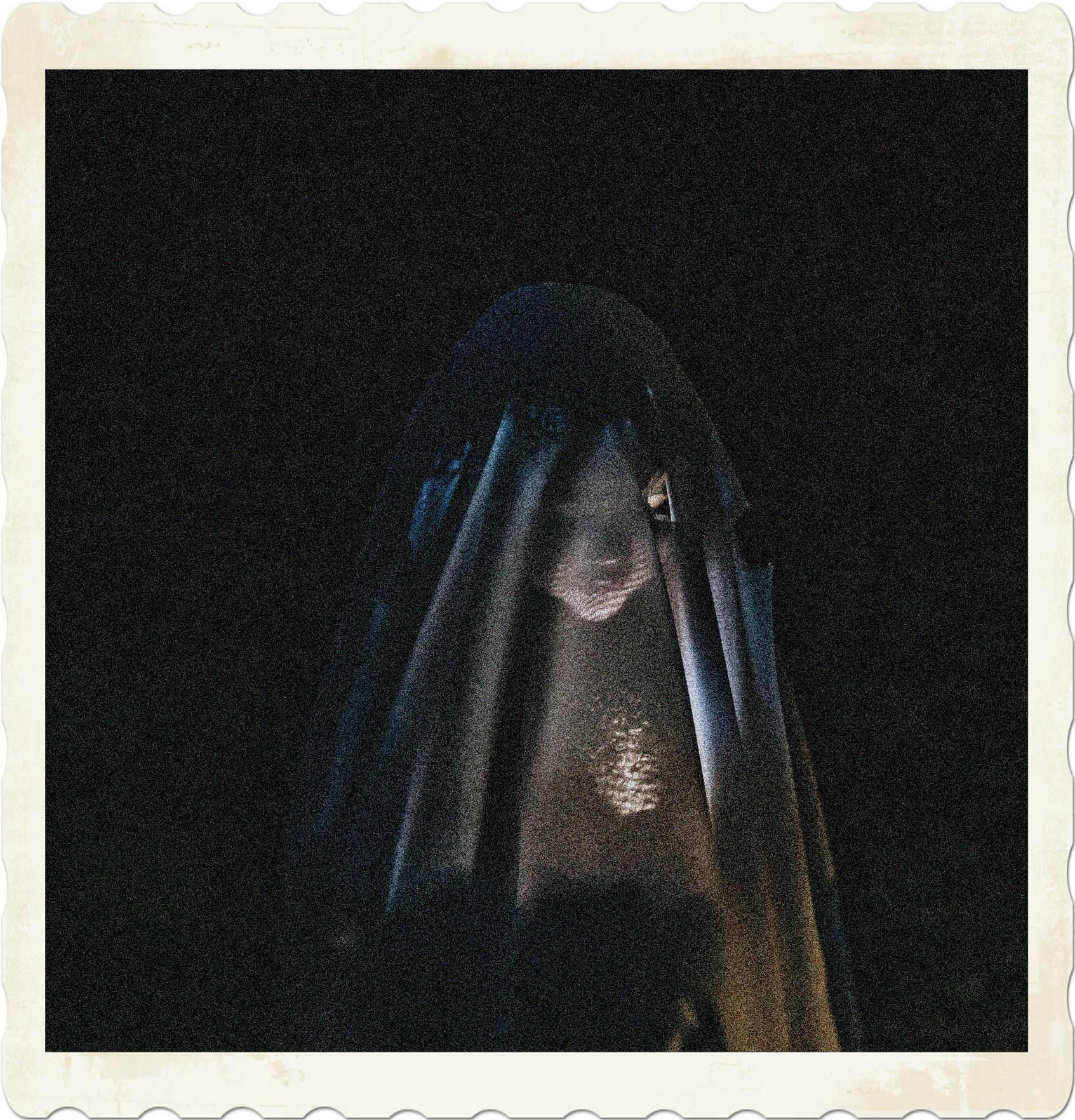
“Very funny,” Cecil said. “The dead are rising.”
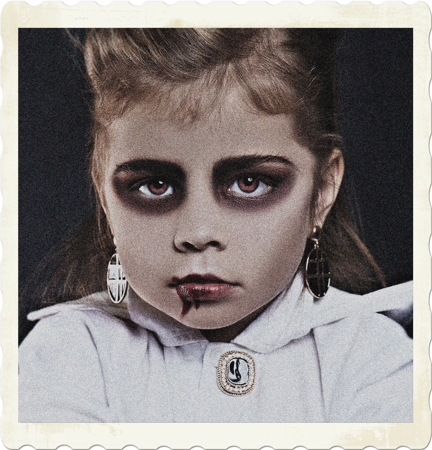
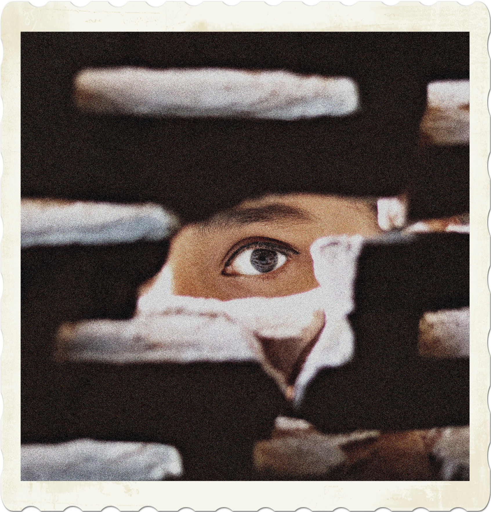
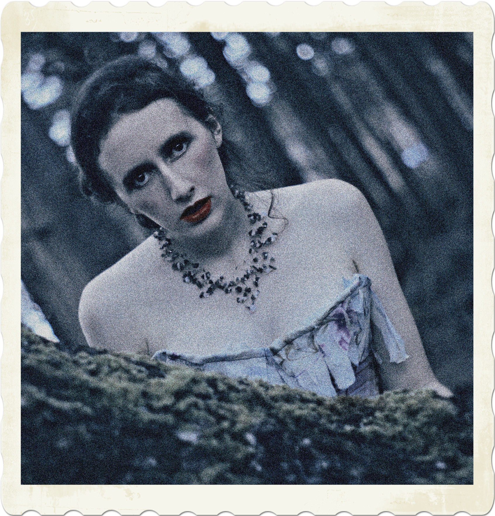
That kind of statement was not as helpful as it sounded. Vampires were essentially undead, hence most of their guests had a tomb or headstone with their names on it. This hotel catered to plenty of things they classified as dead, some of which no one had a name for.
“Can you be more specific?” Max asked.
“Walls are bleeding in three bedrooms, power flickering in and out all over, cold spots, shrieks and lamenting,” Cecil said. “It’s all over the hotel, so it can’t just be one powerful spirit.”
Disclaimer: This excerpt from The Van Helsing Impetus is currently in development. There may be typos, errors, omissions, inconsistencies and so forth. The image is sourced from Pexels.