“Come…” John said sternly.
“No, James,” Kaylee said, “I’m done!”
“That’s my girl,” Julia whispered and realised how that outburst did not rouse any attention. Even in the worst dive Julia came across, the bartenders at least pretended to care… unless this is normal.
Kaylee recoiled away. Before Julia could think, she was standing, with every muscle twitching, ready to pounce.
“I said no!” Kaylee yelled.
“She said no!” Julia yelled.
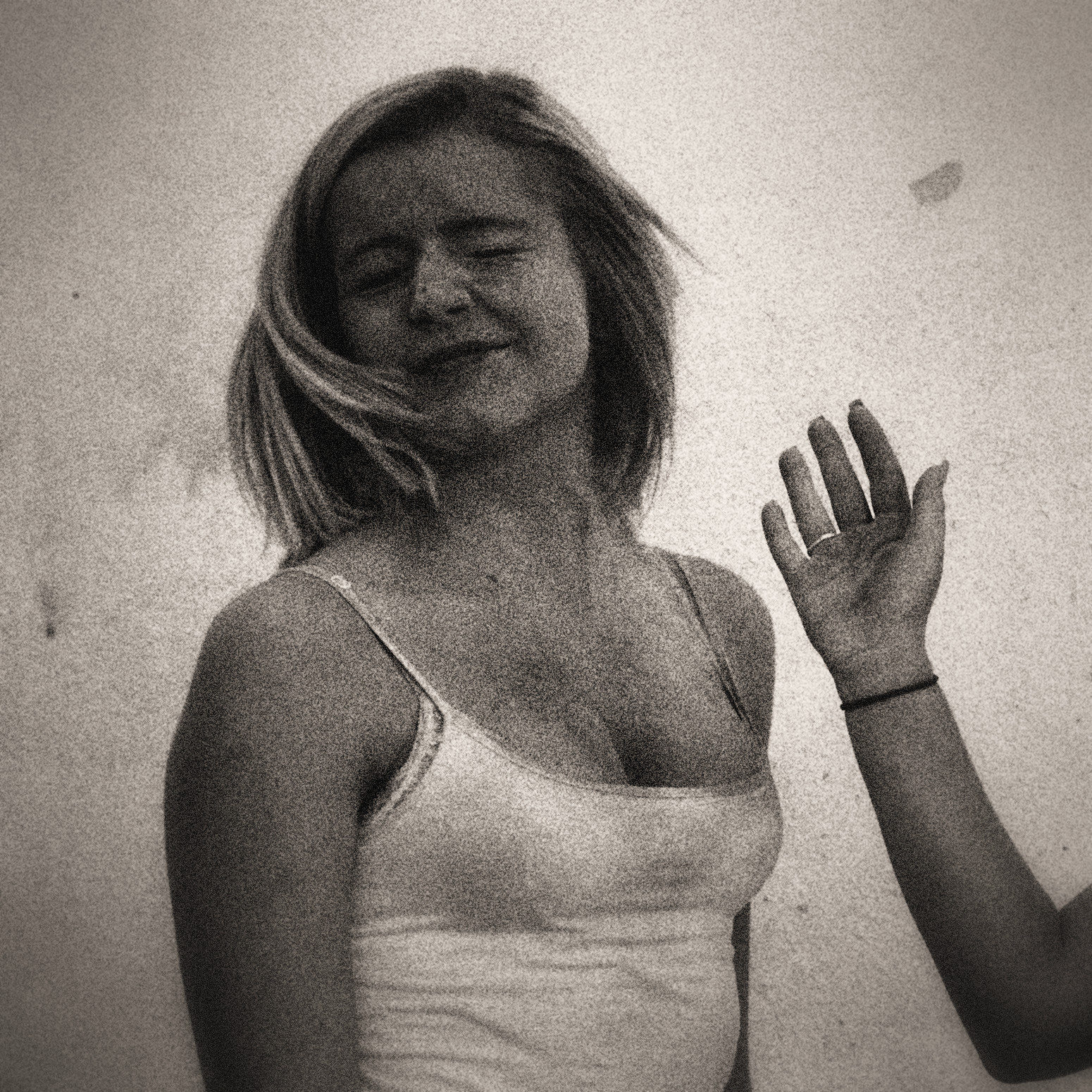
Disclaimer: This excerpt from Dark Hearts is currently in development. There may be typos, errors, omissions, inconsistencies and so forth. The image is sourced from Pixabay.