“I told them it was the decent thing to do,” Kaylee added.
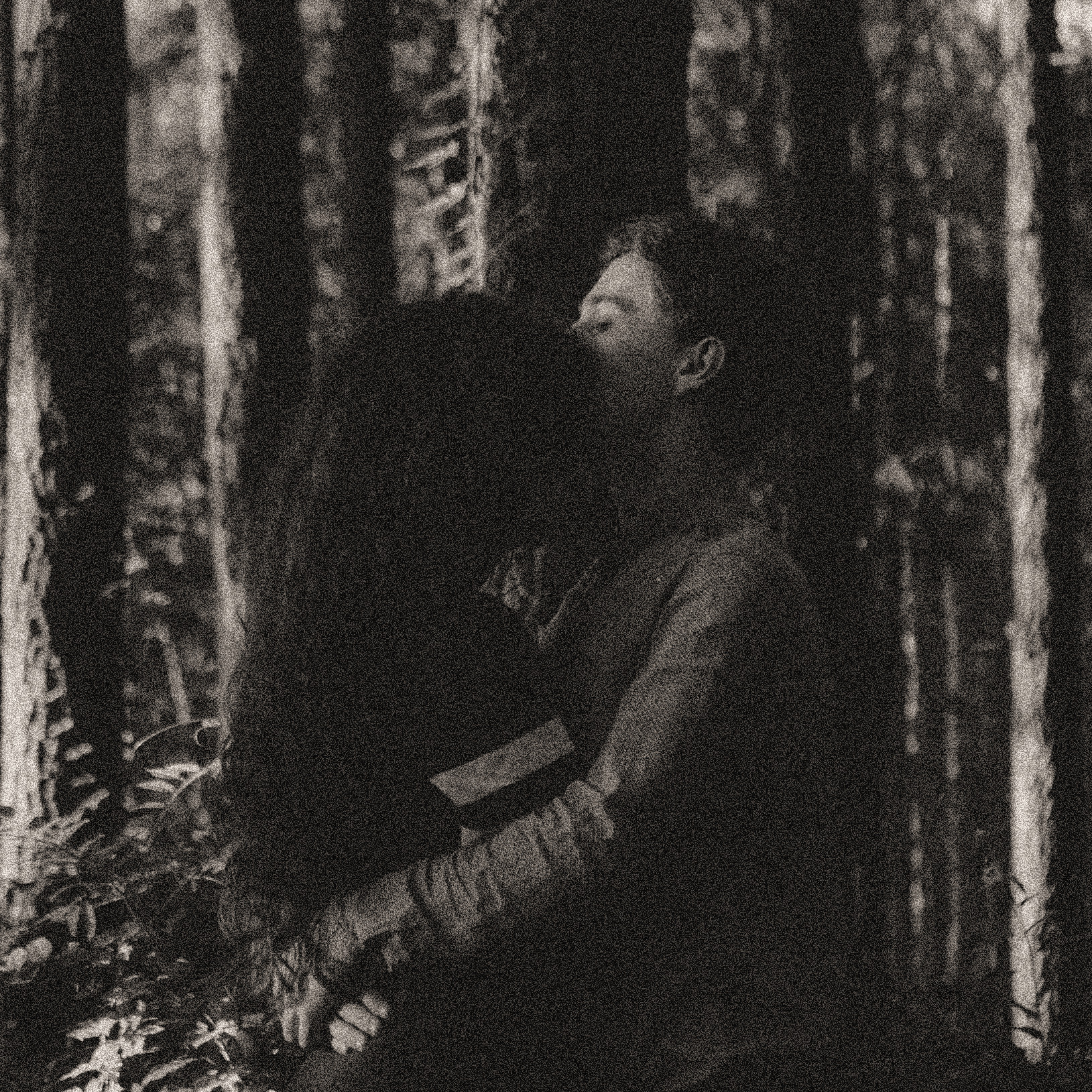
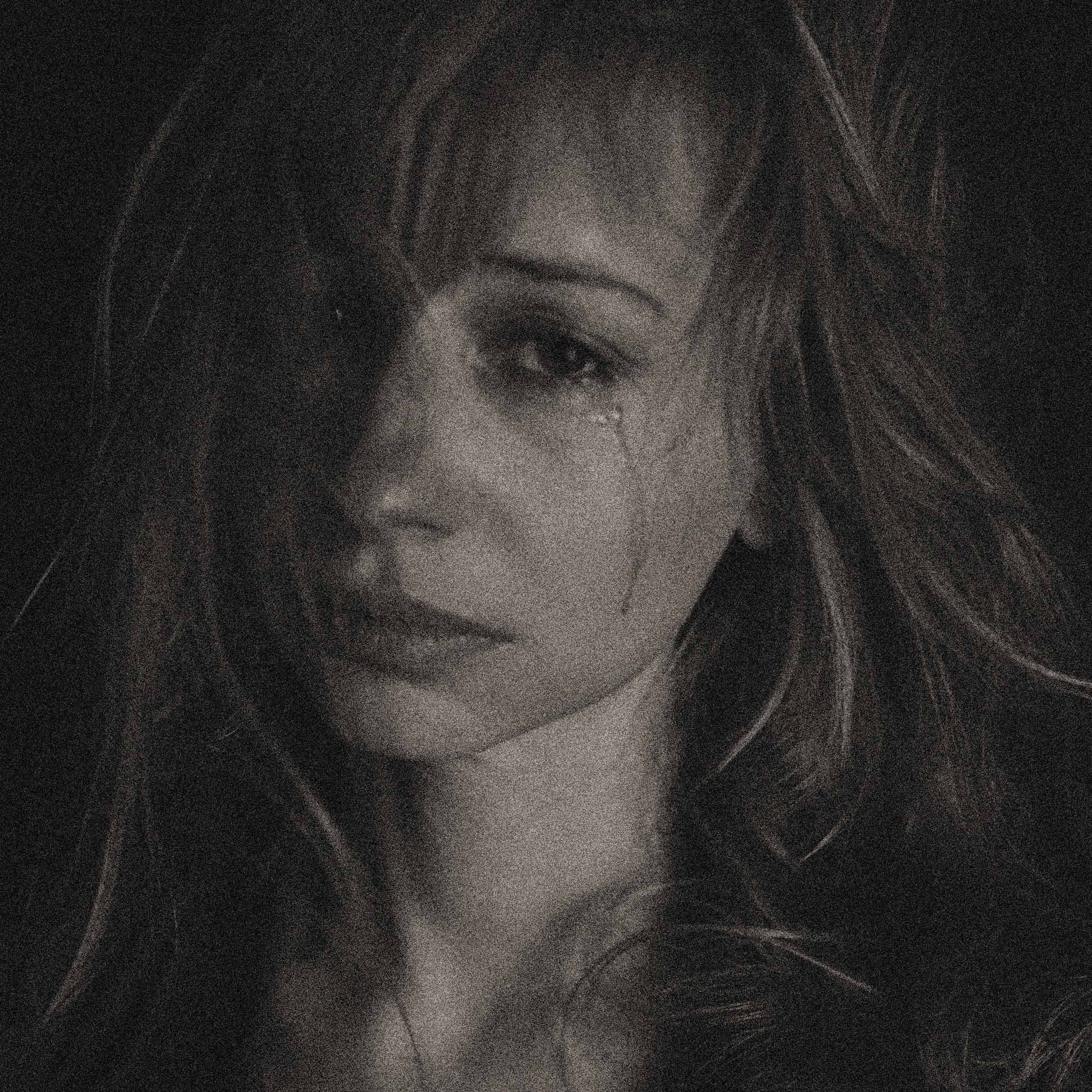
Hearing those words left Julia flustered and warm. She often did when someone showed genuine concern for her well-being, because she was undeserving of it. They might feel differently if they knew I was a werewolf.
Disclaimer: This excerpt from Dark Hearts is currently in development. There may be typos, errors, omissions, inconsistencies and so forth. The image is sourced from Pixabay.