Dressing up the Cover – Part 2
This is Part 2 of the Dressing up the Cover tutorial and previously we covered Font Selection and Licensing.
When using Corel PaintShop Pro there certain behaviours that you should be aware of before moving on. Being unaware of these pitfalls can lead to a great deal of aggravation.
Resolution Matters
The resolution that you with with makes a difference for a lot of operation. If you recall from Digital Alchemy tutorials, we increased the resolution of the image then used Brush Strokes under Art Media Effects to make it look more like painting. Ever wondered what would happens if this same operation were to be done at a lower resolution?
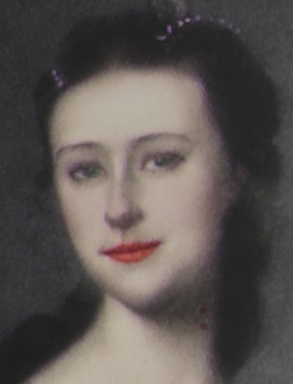
The image below was generated using the full resolution and matches the one we generated in the tutorial.
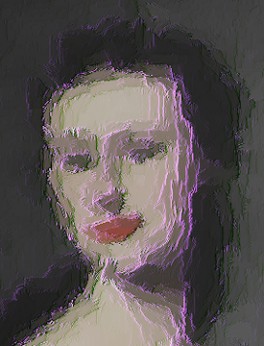
This second image was done using the original resolution. As you can see, the image is no longer recognizable and most of the details have been lost in the operation. This is not the desired effect since it radically changes the look and feel of the work.
While we could change the Brush Strokes settings to work on a smaller scale, the truth is that this option is not always available. Hence you may never be able to achieve the same look by working at alternate resolutions.
Working in large resolutions has its own problems, since memory and processor usage increase so operations take longer. The Brush Strokes effect we used above took several minutes to run at full resolution, while was done in seconds for the lower resolution image.
Higher Resolution Blues
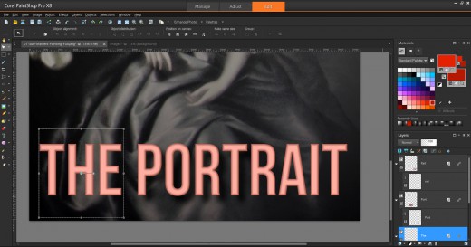
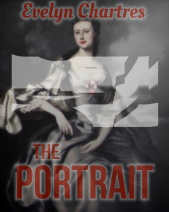
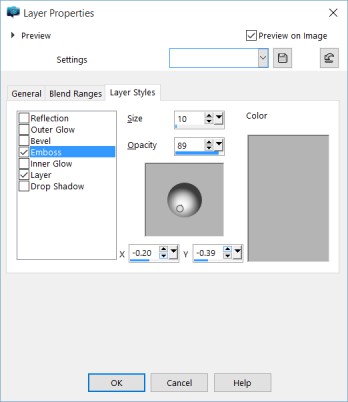
At higher resolutions, Corel PaintShop Pro will not always complete its operations. When using Layer Styles some text some effects will trail off. This seems to be a problem related to the overall area the program is working with. For example, in the image below we added a Bevel and Drop Shadow.
You can see the two last letters are not fully rendered, a matter which is obvious when you compare the two visible T’s in the title.
|
Note This rendering behaviour was seen in Corel PaintShop Pro X7 and X8. It may not have existed in prior versions. |
Fortunately there is a workaround, though it requires splitting the title into multiple Vector Layers. Each layer will be rendered individually to display as expected.
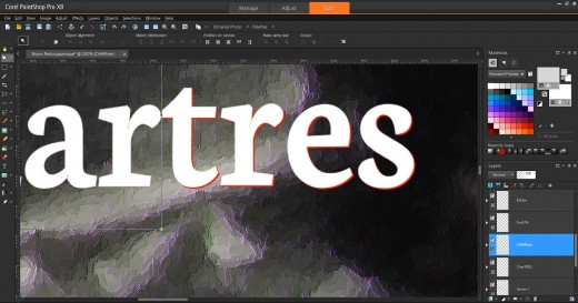
To make it easier to align the components together, create the complete Text Line, then create them in smaller parts. It is recommended that you use different colours for the reference, so that you can overlay and observe where you not aligned, like below with the tres section of the Author Name.
Above we have both sets of fonts under one Vector Layer. As long as all the components are in the same layer they will render improperly. So we need to create two new Vector Layers and transfer the parts into them.
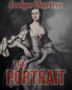
Once the parts have been moved, you must individually manage Layer Styles for each Vector Layer. Use the same settings for Drop Shadow and Bevel. Once complete your fonts will render correctly like we see in the image below.
Now that the effect renders properly, the image can be exported without incident.
|
Note When satisfied with the look of your Layer Styles disable or hide them. When Layer Styles are on or visible Corel PaintShop Pro slows down noticeably. |
Watch Your Groups
How you group your elements may play a part in how they are rendered. When dealing with Layer Styles, distant items can create artefacts in between for no logical reason. To showcase this behaviour, we added an Outer Glow effect, with a Transparency and get artefacts in the middle.
The generated material can be a nightmare to remove, especially at high resolutions since the system responds slowly. The easiest option is to remove this effect entirely and make sure that the Top and Bottom Text Lines are in separate Vector Layers before enabling the effect.
Now have the effect desired without introduced artefacts. Easy!
Unexpected Effects
There are various behaviours related to the Text Tool which should be noted.
Creating Multiple Text Lines
When you are creating a Text Line, you cannot simply click elsewhere to create a new Text Line. One way I found to get around this limitation was to switch to the Pick Tool then revert to the Text Tool.
Alternatively you can click on the Background Layer which will have the same effect. Additionally this method will force the creation of a new Vector Layer vice stacking them into the same Vector Layer.
Text Wrap Around
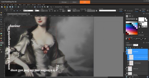
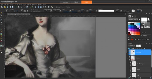
The first behaviour relates to elements created when using the Rectangle Tool or similar. Rectangles, ellipses, symmetric and preset shapes will change the behaviour of your Text Tool if you accidentally work too close to them.
This image outlines one of the more common problems.
When we clicked near the border, the icon changed to a Text Tool with a Border. Now text will wrap around the object in question. When expected, this is an awesome feature, otherwise it will drive you up the wall!
Text Boxes
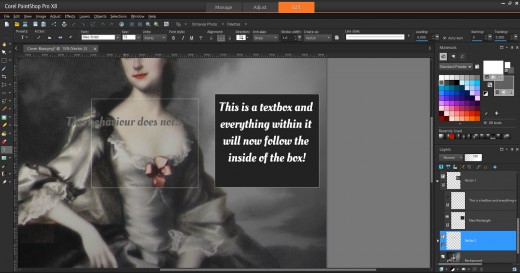
Now when you click inside of the box, text will flow within the confines of the shape. This essentially creates a Textbox which is a desirable feature that should have been incorporated into the Text Tool directly. However, there is a catch and if your background is transparent this capability will not be enabled. The screen below demonstrates both behaviours.
Watch Where You Click
Attempting to use items from the Tools Bar have the potential to behave differently. Creating text items in quick succession will group them naturally into a single Vector Layer and lead to the problems outlined in Watch Your Groups.
As a test we used the Rectangle Tool to create a new Rectangle. We also did not pay attention to the selected layer and ended up passing on the set Transparency and Layer Styles to the new object.
This can lead to confusion and generate hard to remove artefacts. So be aware of which layer you are working on prior to moving forward.
|
Note If you get into the habit of selecting the Background Layer prior to every operation, then newly created elements will fall under a new layer. You can rearrange them at a later time. |
In Part 3, we will create a New Image and Place Lady Shade.
