Dressing up the Cover – Part 6
This is Part 6 of the Dressing up the Cover tutorial and previously we covered Taglines and Layer Styles.
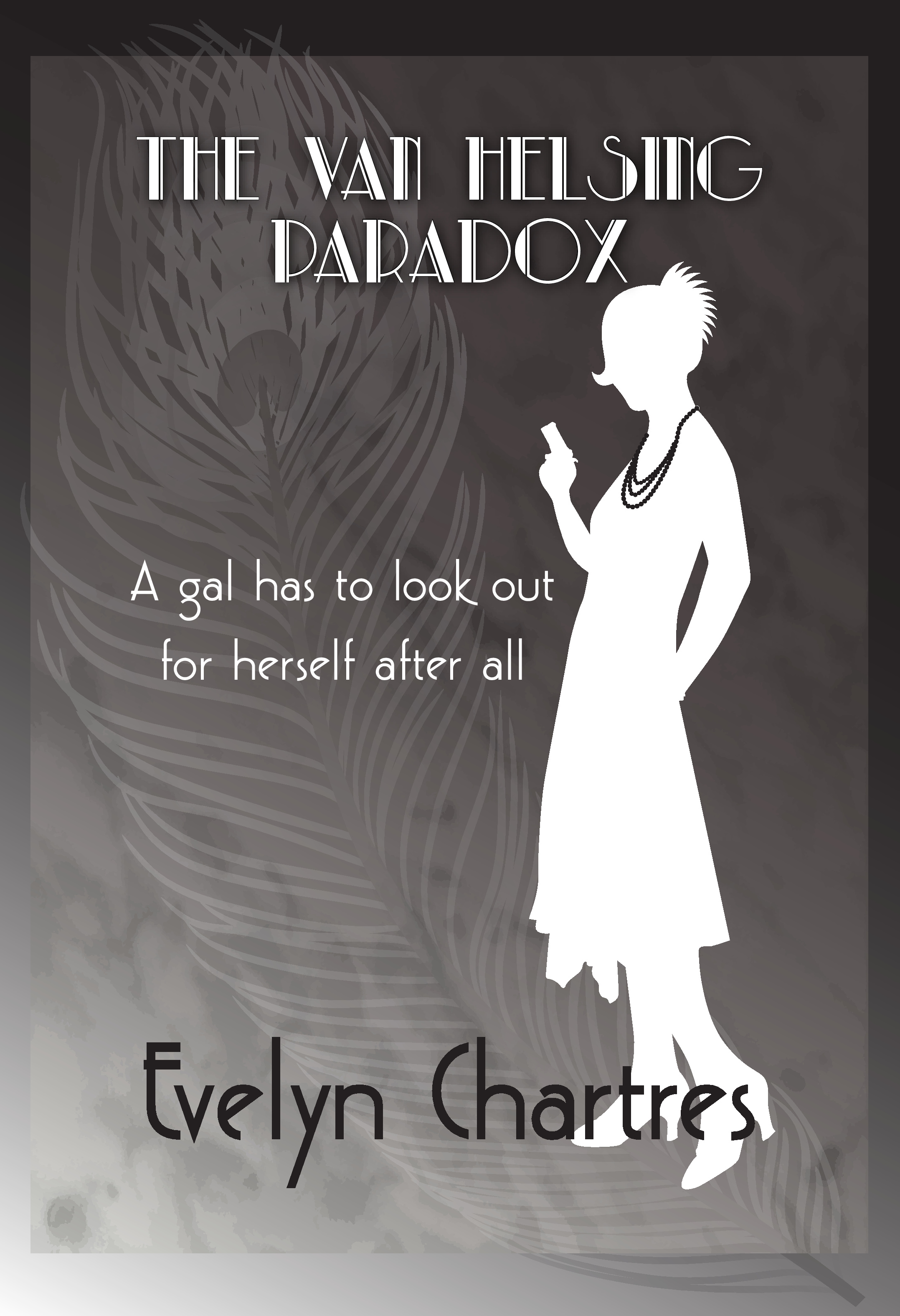
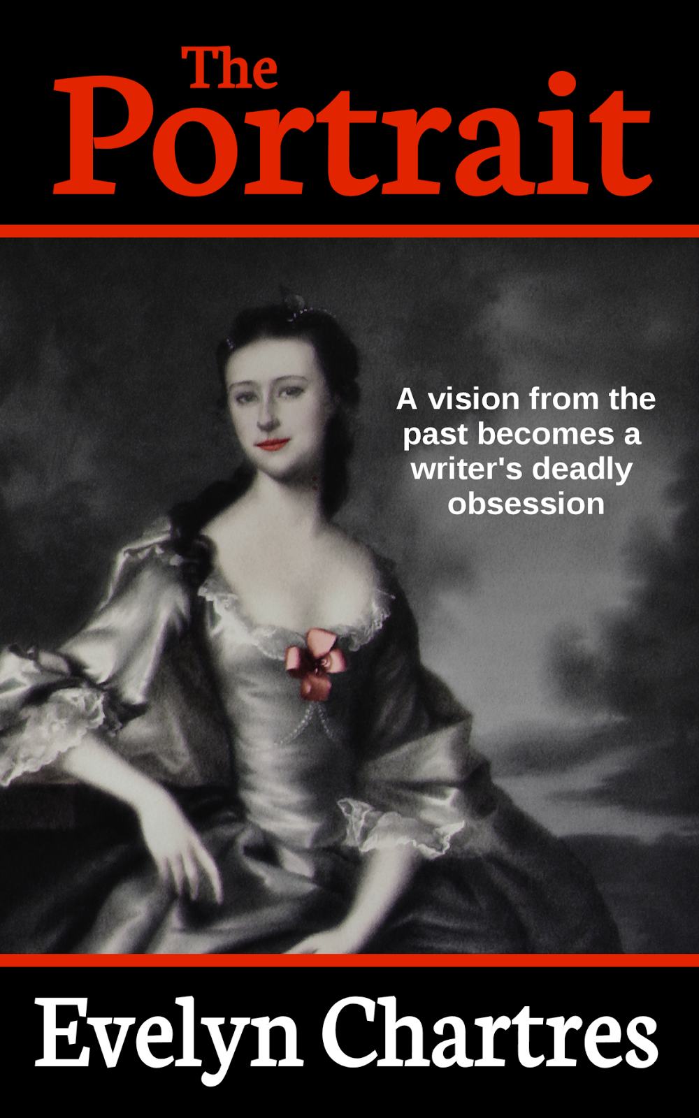
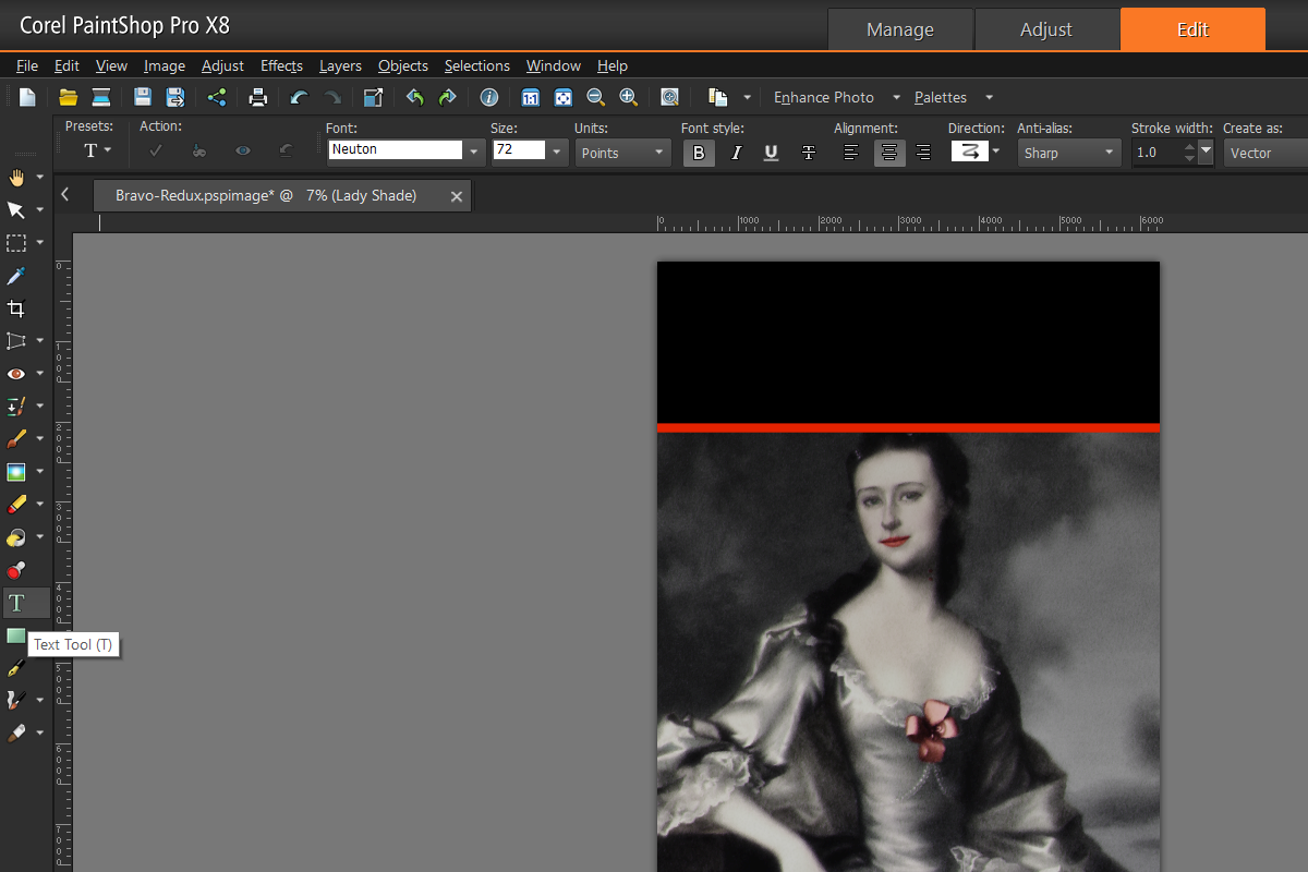
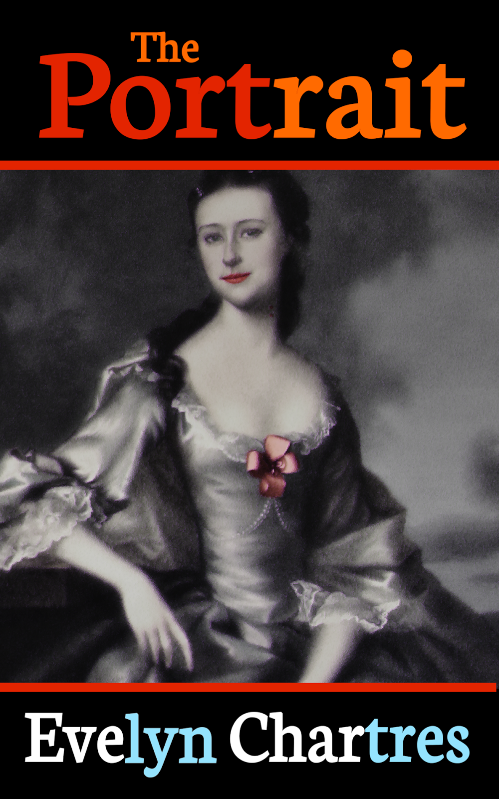
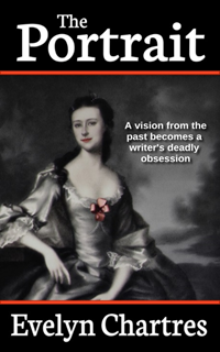
 Notes on Bravo
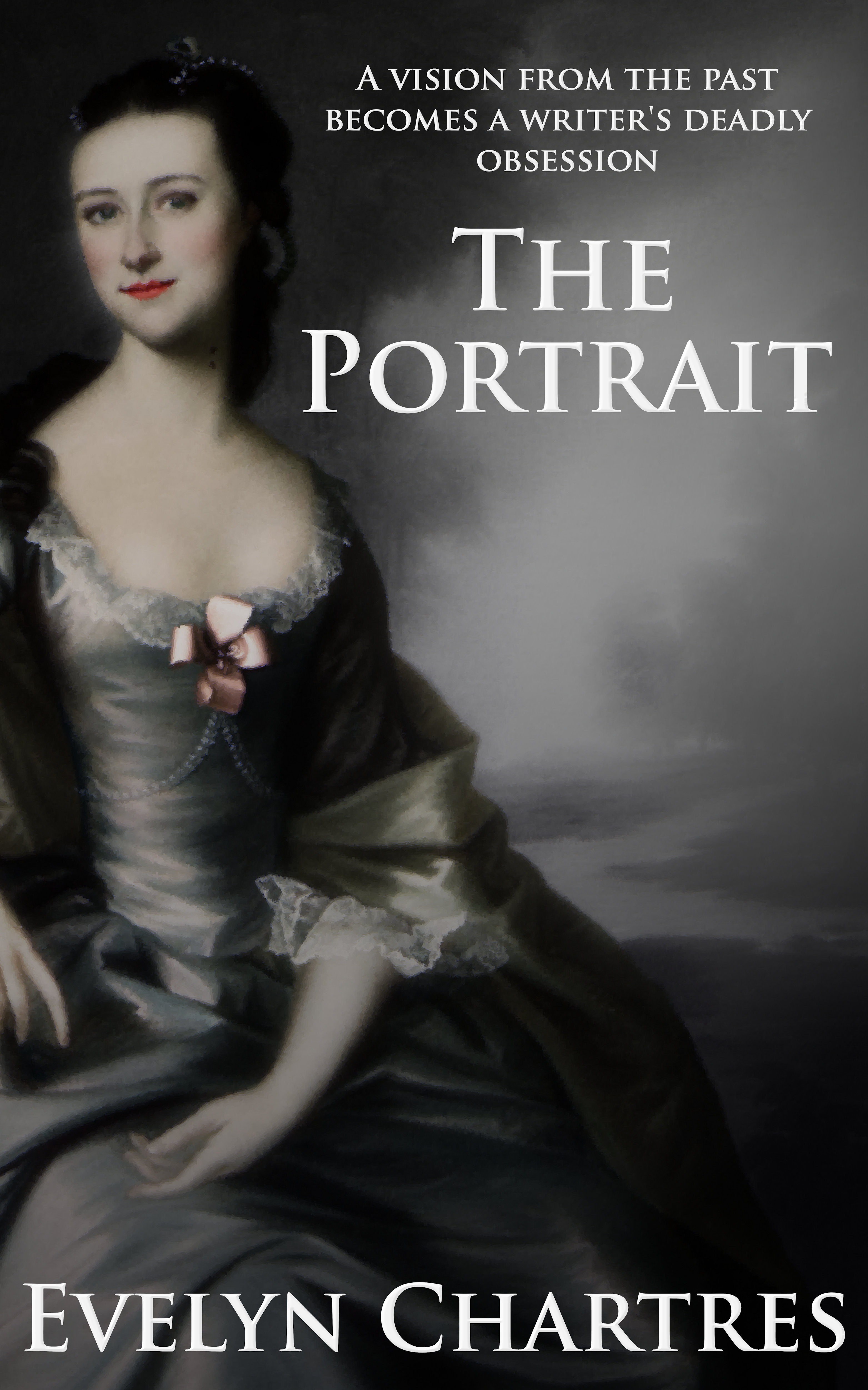
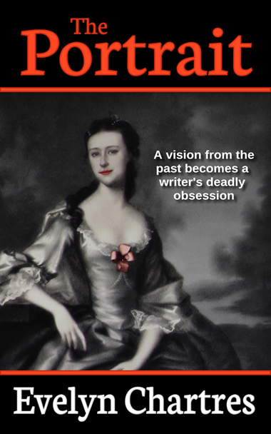
Bravo was originally released along with two (2) other variants and was by far the most popular of the three (3). Feedback shown below led to the creation of other variants.
“Bravo caught my attention better than the others.”
“Bravo looks the most professional, although the fonts are kind of sterile.”
“I’m not a fan of any of them. They all scream —self-published— in the worst of ways.”
“None of them say horror to me. If you’re sold on using the image, I’ definitely try to bring it out in the fonts. Look at some popular horror titles and see what they use. That will give you an idea of what communicates —horror— to readers.”
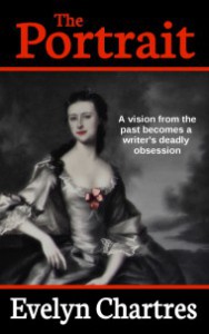
Overall, the points brought forward were related to the choice of font and how the cover did not fit the ideal horror cover. The Portrait does not subscribe to the modern ideals of horror, at least in terms of gore playing a large part.
People expected to see streaks of blood, fangs protruding from the lady’s mouth or vast amounts of gore. This worked against the story of the premise where the supernatural settings are concealed for most of the novel and would potentially spoil the surprise!
There was a noticed distaste for the red borders employed with this particular variant. While I initially believed that they infused the cover with a bit of colour, people predominantly disagreed and preferred to have no transitions as all.
Over all I managed to pick up a few points to work on:
- Keep some distance between the outside edges of the image and the font. Text elements are more likely to remain visible if the image needs to be truncated or applied to a printed cover;
- The use of red for fonts to add in colour may not work out as expected. Red does not display well in black and white images;
- There is a strong preference for covers to use an image covering the whole of the visible area. This led to the development of Hotel and India variations which are covered later;
- Font selection is key and has been discussed before. There was a strong push for Trajan Pro as a general-purpose font.
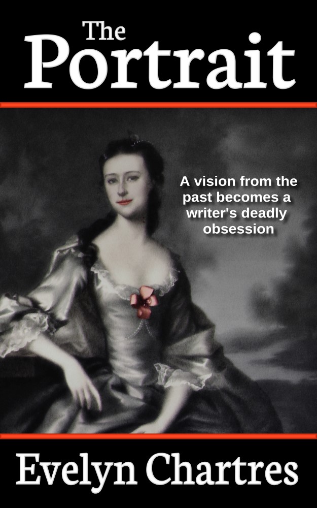
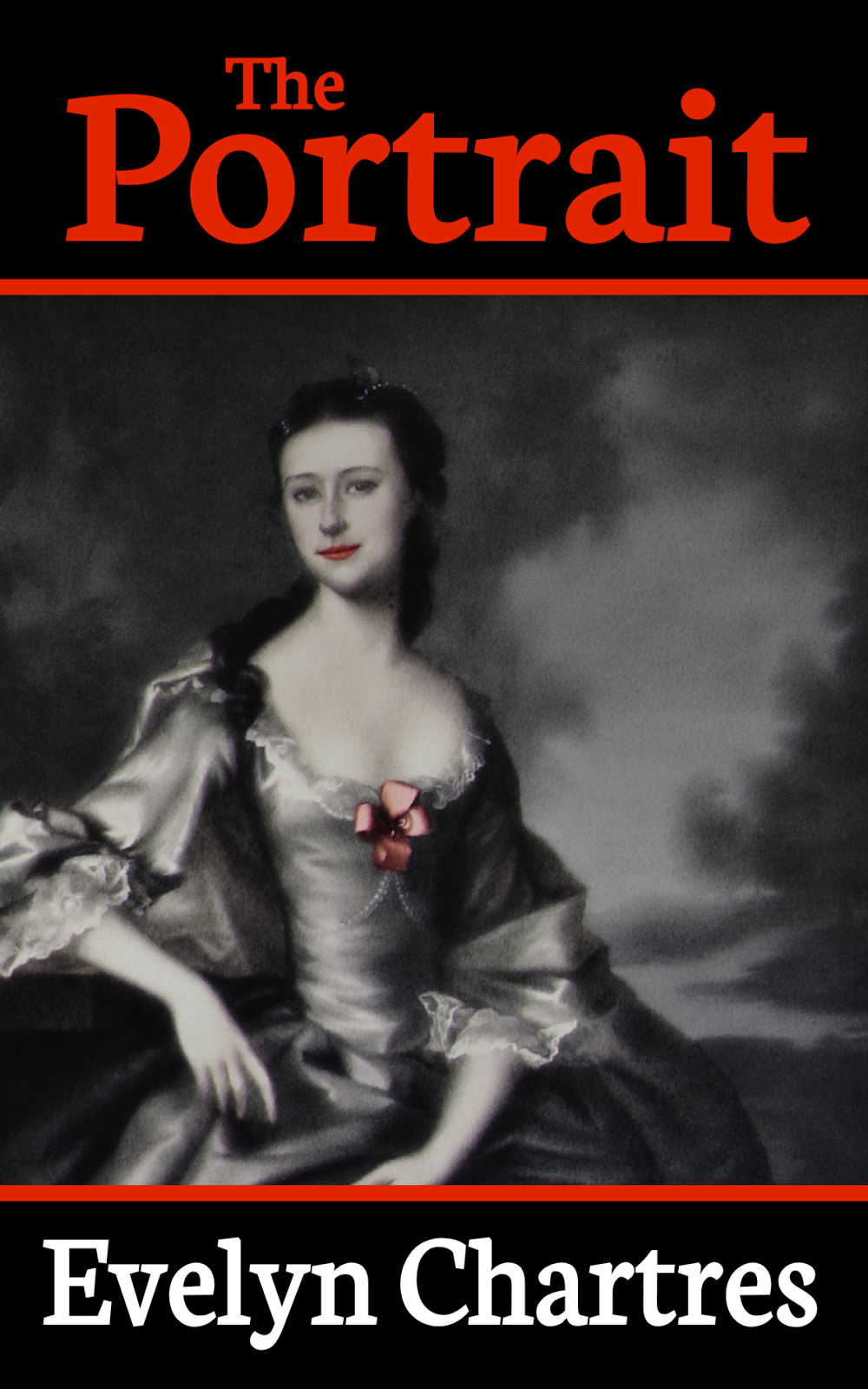
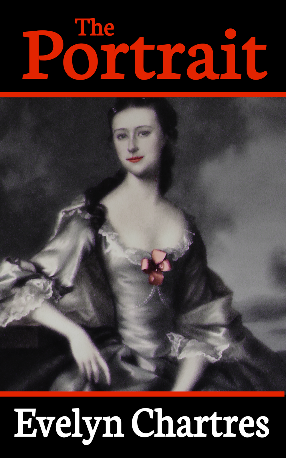
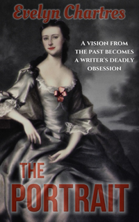
Some recommendations were applied to Bravo which created the variant below. While it does not address all of the faults, it does provide an incremental improvement.
A Hotel Visit
Hotel was a variant that aimed to make use of different fonts that would grab the attention of a potential reader. This version also made use of transparencies and the outer glow effect which differs from other versions. While Hotel universally reviled in comments it does have certain features that were fun to explore.
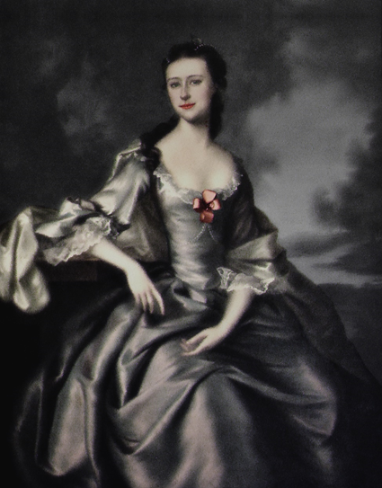
 You will need to make use of the Lady Normal Base, to proceed with this aspect of the tutorial.
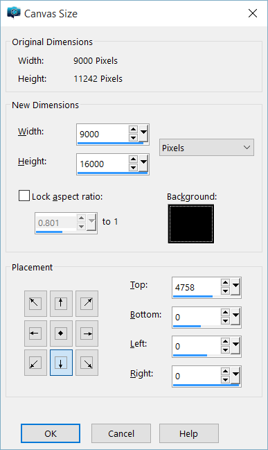
 The cover size is longer than the original image allows . To achieve this we needed to create a mirror image copy then join them at the seams. This increases the space above her head to prevent the Author’s Name from obstructing her face.
From the Image menu, select Canvas Size.
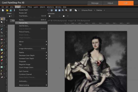 A new Window appears, which permits you to adjust the Size of the canvas. Increase the Height of to 16000 pixels then ensure Placement is set to Bottom, Middle as shown:
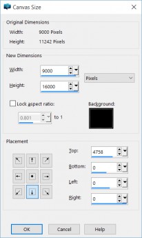
Click on the OK button, which adds an empty space above the image found.
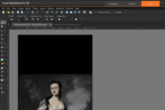 Using the Selection Tool, make a copy of the top portion of the Base then Paste as a New Layer. You up with two copies of the Top with the new selection that needs to be flipped.
From the Image Menu select Flip then Flip Vertical.
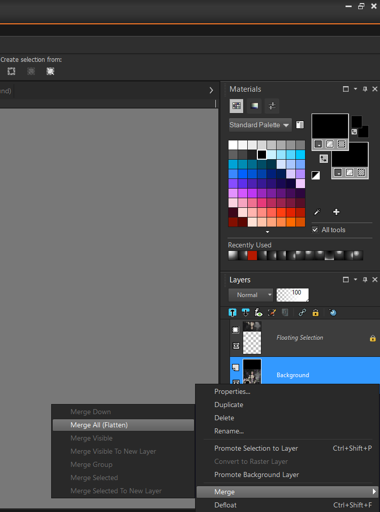
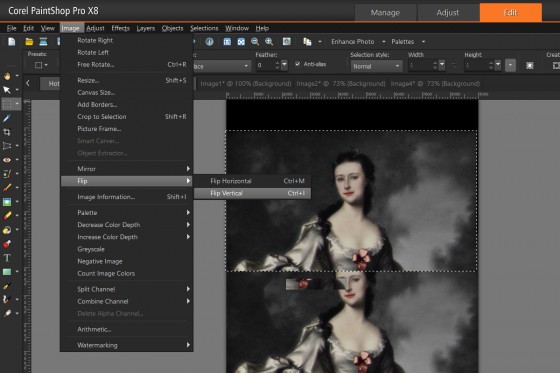 Line-up the images as though they were part of a mirror image. Once satisfied with the merger, right-mouse click on the layers then from the Merge Popup-Menu select Merge All (Flatten).
 This operation will merge both layers together. You may need to experiment until the connection is seamless.
Next add the Author, Title and Taglines. As mentioned previously, Layer Styles for Author and Title employ of Outer Glow, Emboss and Transparencies to get the desired effect. To reproduce the effects showcased on the cover the following fonts were used.
- Title — Bebas Neue Bold
- Author — Oleo Script
- Tagline — Cinzel (Bolded)
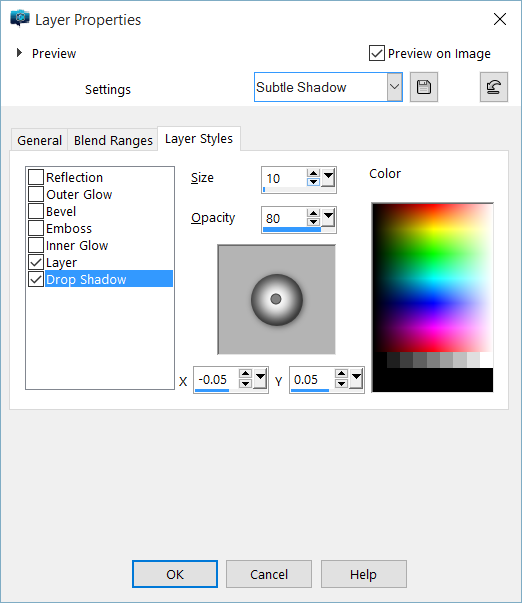
For Layer Styles adjust until settings match the options below:
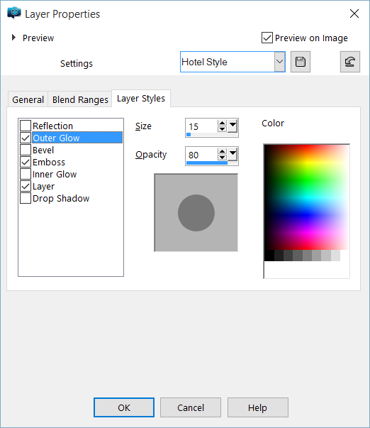
 The next step is to adjust the Outer Glow, set it to match those shown below:

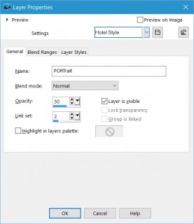
While there are a lot of ways to adjust transparency, you can do so from the General Tab of the Layer Properties window. Copy the settings found below then save it for later use. This ensures consistency when applying it to other layers.
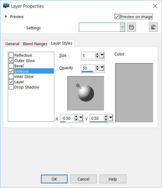
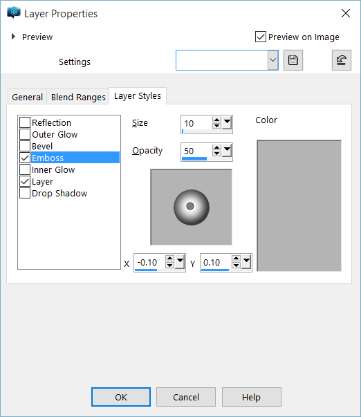
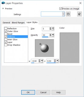
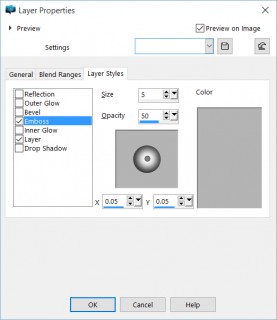
The Tagline only makes use of Emboss, copy the settings below to match our style.
The Tagline only makes use of Emboss, copy the settings below to match our style.
You end up with a cover which looks roughly like our sample.
A Trip to India
India was not one of my designs. Ironically, an acquaintance used a phone app to whip up a design she felt worked well. This formed the basis for cover design used on The Portrait.
Other than making use of Lady Ethereal as a base, this design uses techniques which have been explained before. To the following fonts were used:
- Title – Cinzel (Bolded)
- Author – Cinzel (Bolded)
- Tagline – Cinzel (Bolded)
In Part 7, we will talk about making a Cover Swatch.