Dressing up the Cover – Part 7
I discovered through trial-and-error that dropping a series of images into a gallery then asking users to comment was inefficient. Some of the reasons for this include:
- Users tend to ignore titles and will comment on the first, or third image. Unfortunately some sites will vary the order;
- Users have a hard time comparing covers which are very similar in design. This requires them to look back and forth, which makes comparisons more difficult.
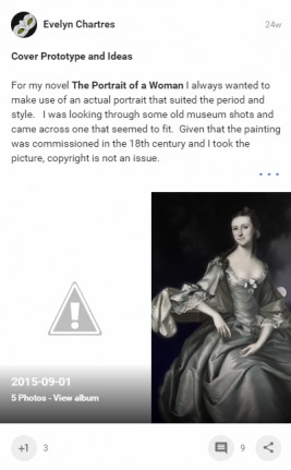
- Images dropped into a gallery may not exist or be accessible later. The first time I created a sample gallery to compare against, the images became unavailable and was unable to address the issue. This particular behaviour is showcased below:
 To mitigate the above points, I created a swatch containing all of the images. This permits me to provide titles, a consistent order and can throw in thumbnails to compare how covers will appear at smaller dimensions. That single image will mean users need only click-once to get a view of all versions, which increases the chance of getting meaningful commentary.
Creating a Swatch is straightforward; create a canvas large enough to fit the desired versions. Since Amazon Kindle Direct Publishing lists covers should be least 625 x 1000 pixels, all featured variants meet the minimum.
Using larger covers in the swatch can make it too large to upload at many sites. Additionally, the swatch would take more time to view and require users to zoom-in and out frequently. Hence sticking to the minimum provides avoids a whole slew of issues.
Cutting Down to Size
Before we begin, we need to create usable variations. The files we created contain Layers and Styles which react differently at lower resolutions. Additionally, we want to preserve these originals, so use the Save as Copy feature to avoid modifying the source files.
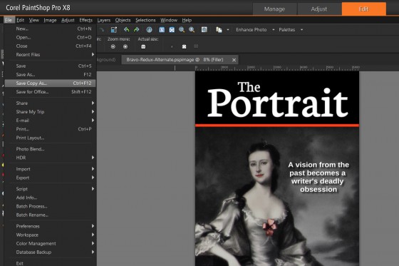
Open up your Bravo Paint Shop Pro project file then from the File menu click on Save Copy As.
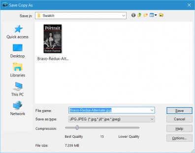
 This feature permits you to save a copy of the image without modifying the working image. Select either JPG or PNG formats then click on Save.
|
Note
Ensure that your save path and file name are correct prior to completing this operation. |
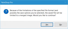
 You will be presented with a warning about losing Layers and Styles through a Merger. This is precisely what we want, since the image is to be resized later. Click on Yes, then open this newly created image.
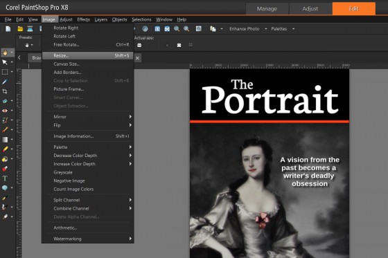
 From the Image menu click on Resize.
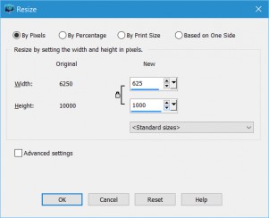
 A new window will pop-up. Resize to 625 x 1000 pixels or settings that allows you to meet the requirements. Since our examples made use of increments of the minimum size, so the window appears as follows:
 Once satisfied, click on the OK button.
Repeat the above steps for each variant; in this tutorial we did the same for Hotel and India.
Creating the Canvas
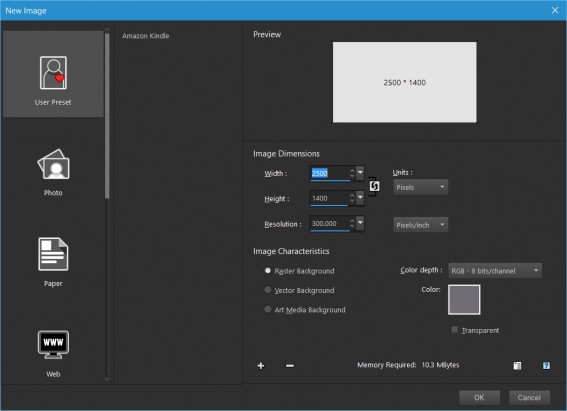
Since we are dealing with three variants (Bravo, Hotel and India) we need to create a swatch that permits fitting in all three. We also need to include a buffer since thumbnails will be added as well. So we create a canvas that is:
- Width — 2500 pixels.
- Height — 1400 pixels.
- Resolution — 300 dpi.
From the File menu click on New. This will bring up a new window, replicate the options shown below:
 The colour of your background should be something neutral. This provides a separation between the covers and will not distract the viewer. For the above example, we used a variant of grey.
Once satisfied click on OK and a new image with the appropriate dimensions will be created.
Dropping in the Variants
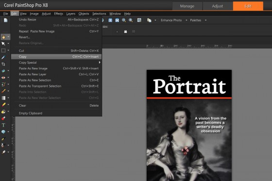
Now drop in copies of the variations onto the canvas. Click on your copy of Bravo then select the Background Layer. Now from Edit menu, click on Copy or use the CTRL-C keyboard combination.
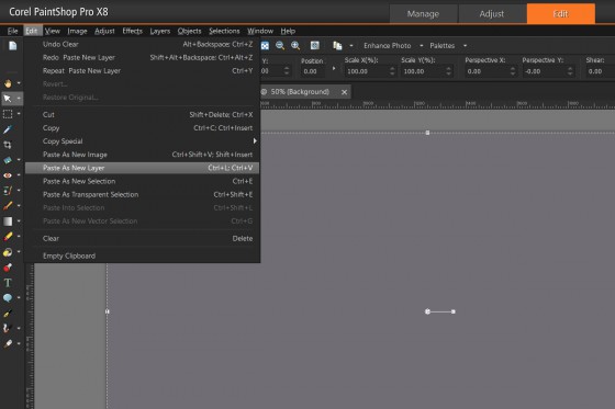
 This will place a copy into your clipboard. Switch to your Swatch then from the Edit menu click on Paste As New Layer.
 This will drop-in Bravo, which can be moved anywhere onto the canvas. Since this is our first entry, place it near the edge on the left and leave a bit of spacing.
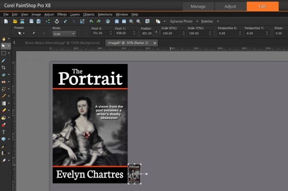
 Now add-in the thumbnails for Bravo. Switch to your Copy of Bravo and shrink down the image to a maximum 160×160 pixels. Repeat the Copy-and-Paste operation done previously then drop-in the thumbnail.
 Now we can compare the full-sized cover to the thumbnail. This permits us to see how the image appears on Amazon.com. Now we lack a method of seeing how it appears on a black and white display like the Kindle Paperwhite.
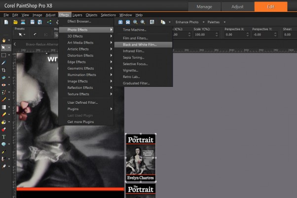
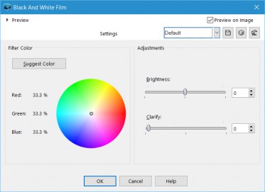
Drop-in another thumbnail then from the Effects menu, select Photo Effects then Black and White Film.
 A new window will appear, I found that Default is sufficient for this step.
 When satisfied, click on OK.
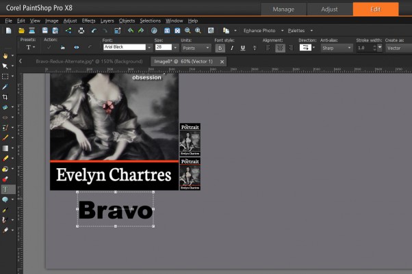
To add in a label, from the Tools Bar, select the Text Tool. For this example, Arial Black at 28 points set all Black was used. Adjust as necessary to end up with a result that looks like the following:
 Now you have the following on your swatch:
- Main image;
- Thumbnail;
- Black and white thumbnail; and
- Label.
Repeat as necessary for the other variants.
Final Touches
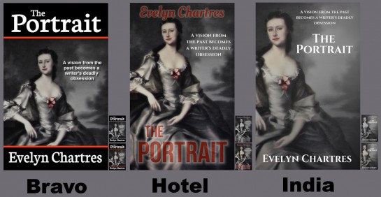
Once finished, crop the Image to remove any unused space. You should end up with an end-result that resembles the following:
 Now you have one image that gives you an overview the three covers. It’s easy to compare one against another and allows you to see how they hold up at lower dimensions and on black and white displays.
Hotel does not display well as a thumbnail or in black and white. That alone should steer you away from that design.
Create these whenever you wish to compare a sample set of covers.
